RoboFu
One of the green rats
SInce there seems to but a lot of negative air around PS right now .. I would like to take a quick look back on one of my most favorite console designs of all trime.

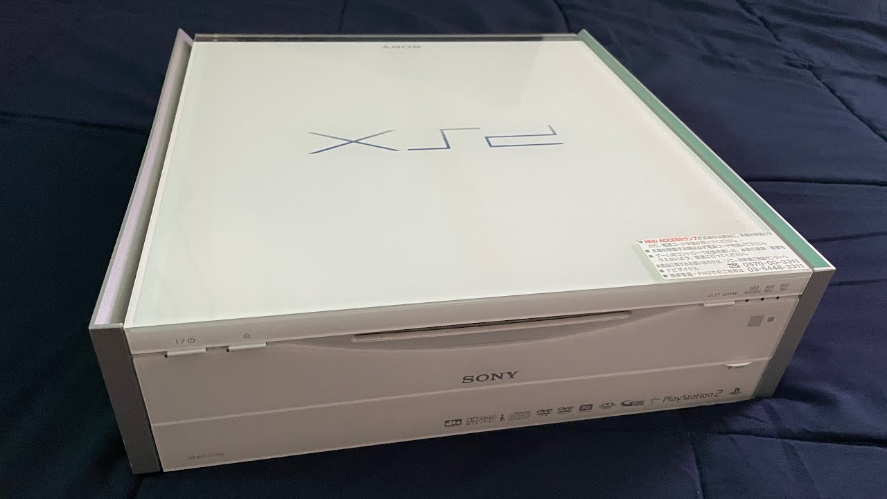
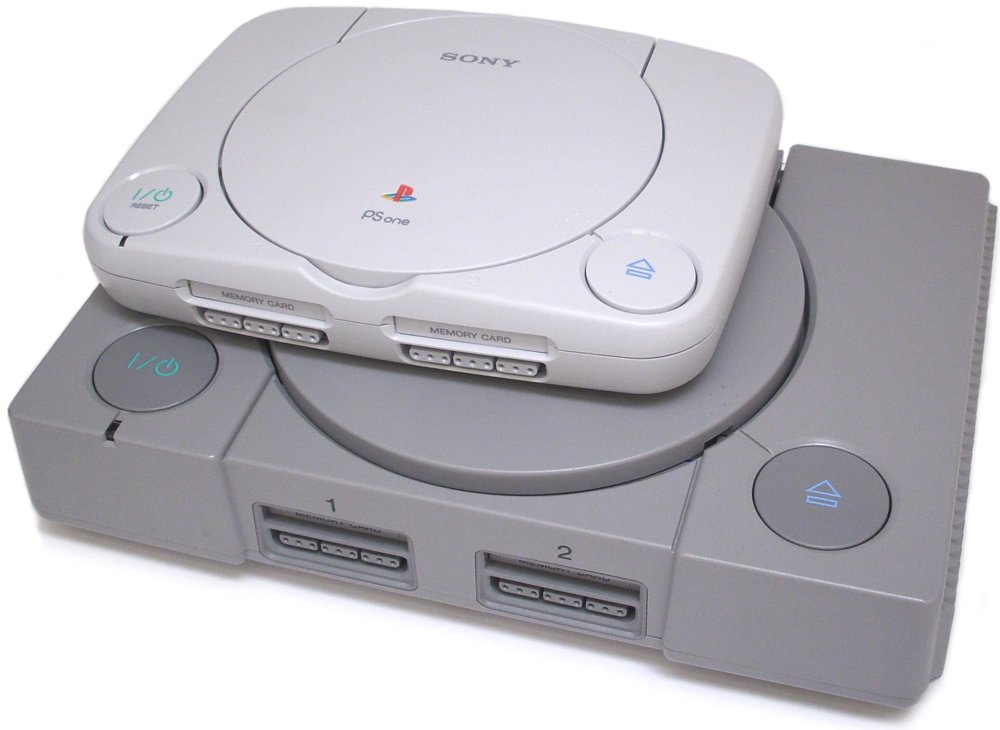
Every decision about the design and marketing of the PS2 was a master class in the fields. One of the most beautiful consoles ever both the launch and slim model and superb. The only consoles I think I have ever just held and looked at many times.
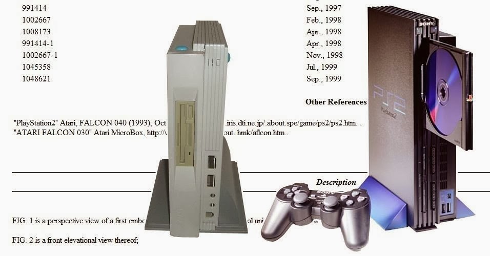
The design was actually taken from an unreleased Atari Falcon micro box computer. This is not a rumor it is actually in old design documents. But of course they added that sony design elegance to really make it striking.
The Black on Blue was cool enough but tying it all in from the highlights to the bottom of the disks themselves was pure genius. And it all stemmed from the most perfect logo to ever be created....

the deep blue with the angular morden font wa simple yet so powerful.
The whole marketing package was just one awesome concept after another. I dont think I have since seen a product tied together so perfectly as the ps2. Just look at the box it came in!

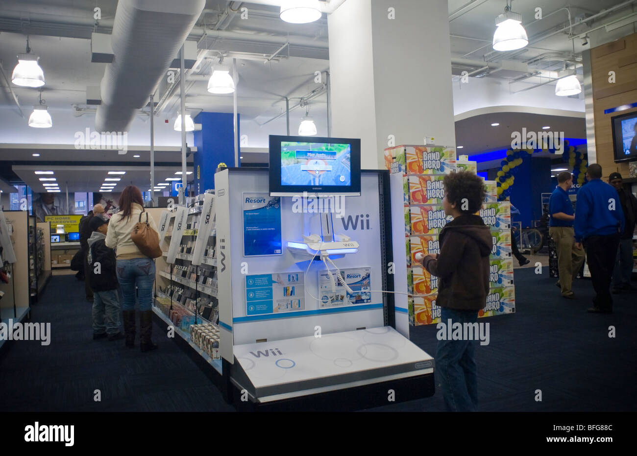
Just seeing a stack of these on a floor at circuit city made you take notice. You wanted to buy it without even knowing what it was lol.
I do not know the person or people who nailed that look and marketing but I hope they got the props they deserved.
Every decision about the design and marketing of the PS2 was a master class in the fields. One of the most beautiful consoles ever both the launch and slim model and superb. The only consoles I think I have ever just held and looked at many times.
The design was actually taken from an unreleased Atari Falcon micro box computer. This is not a rumor it is actually in old design documents. But of course they added that sony design elegance to really make it striking.
The Black on Blue was cool enough but tying it all in from the highlights to the bottom of the disks themselves was pure genius. And it all stemmed from the most perfect logo to ever be created....
the deep blue with the angular morden font wa simple yet so powerful.
The whole marketing package was just one awesome concept after another. I dont think I have since seen a product tied together so perfectly as the ps2. Just look at the box it came in!
Just seeing a stack of these on a floor at circuit city made you take notice. You wanted to buy it without even knowing what it was lol.
I do not know the person or people who nailed that look and marketing but I hope they got the props they deserved.
Last edited: