Vanillalite
Ask me about the GAF Notebook
Windows Phone 7 Official Website!
Neogaf OT WP7 Thread!


So I've been wanting to get a smart phone for a while now. I've been out of contract for a year, and just have been waiting or almost pulling the trigger. My mom got an iphone 4 over the summer which tempted me, and then I was really looking at the Captivate, AT&T's version of the Galaxy S. I kept holding off though. I didn't want the increased cost, and I kept doing the dumb PC thing of as soon as I buy it something better will be out. Enter Tuesday night. I pulled the plug, went to the AT&T store, checked out the focus for myself in person, and pulled the trigger. I guess you could say Tuesday night I cast my die Microsoft's way in the smart phone war. Am I happy with my choice? Is the focus a solid smart phone? Is WP7 the real deal? Read on ahead for at least my initial answers.
3 words: Visual User Experience!
That's how I'd describe Microsoft's approach to the mobile space in 2010. I would say this was the general framework from which all work around Windows Phone 7 centered. It is in this area that Microsoft has succeeded. It is also this mindset in which I will frame how I ultimately view my Samsung Focus and Windows Phone 7 in it's current 1st generation state.
So I brought home my shiny new Samsung Focus Tuesday night. Went into my AT&T store and did a quick check to make sure this was the phone I wanted. I'd read the previews/reviews and this was the WP7 device I wanted. Just had to be sure in person. I played with it for like 2 mins and then was like yep lets go check out. I opted for a new sim as I wanted to redo my contact list. Put the new sim in and activated and booted up. First thing it asks you for is a Live id which I already have from Xbox Live that I also use for skydrive space. Then your up and ready to go.
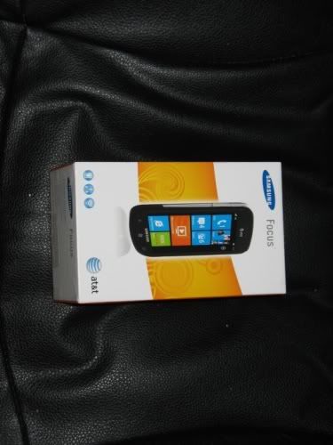
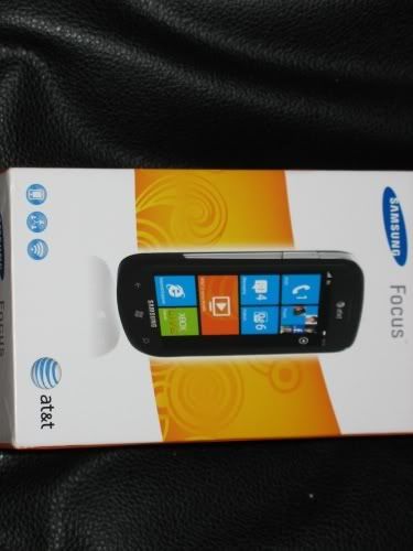
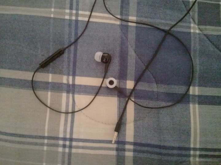
1st things first. Here's the box. Inside you get your normal stuff aka the phone, manual, usb cable, usb charger adapter thing to plug into the wall, and a pair of headphones. The headphones also came with 2 other sizes for things on the end of the buds, one larger and one smaller set. Pretty much what you'd expect from any phone. I already had the latest Zune 4.7 installed which is the full fledged client you'd use ala itunes on Windows (there is a basic Mac sync client recently released).
Right away what struck me was the Focus screen. It's the same 4" proprietary "Super" AMOLED tech that Samsung introduced in all it's Galaxy S phones running at 840x400. Honestly in many ways the focus has been dubbed the WP7 Galaxy S phone. At anyrate the screen just visually pops. It also plays extremely well with Microsoft's new user interface dubbed "Metro". The key here being Super AMOLED is great at producing great blacks, and MS Metro UI consists of either the stock black background or a white version that you can switch to. Comparing the Focus to it's HTC Surround brethren in the AT&T store side by side was night and day. Focus was a clear winner in the screen department.
Now lets get back to the key 3 words we started with, Visual User Experience. After you go through your initial setup your greeted by WP7's Metro UI home screen. It consists of grouping of square titles in blocks of 4 with some things combining two squares to form a larger rectangle. Here Microsoft has pinned some of the biggest hub areas that you'd use such as phone, mail, messaging, music and video, people etc... all laid out in a portrait view. Most of the UI is all presented in a portrait view fashion. MS said think of it as a a window into the landscape UI. Your just moving the window left and right over the landscape view by swiping to see different points of the view. You also can chose from a list of colors for your live tiles.

When needed or wanted though in certain screens such as when your sending a text you can rotate to a landscape view to read and type to send your messages. This honestly works surprisingly well. Your home screen is a list of groups of 4 square titles to which you can scroll up and down to see more. You then can either click on a title to bring it up, click and hold to move or remove said tile, or swipe from right to left to move to the next screen over which brings up your list of all of your applications and hubs in a big alphabetical list.
Everything here is scene as a visual experience. Microsoft created a minimum spec for the initial batch of phones as well as standard hardware things like 3 buttons at the bottom (back, home, and search), volume rocker on the top left, and a camera button on the bottom right. How this factors into the visual experience for the user is the base spec was high enough that Microsoft could leverage the 1st gen snapdragon GPU as well as the CPU. This allowed the WP7 team to create a GPU accelerated UI which is extremely visual with a ton of excellent transitions that also runs buttery smooth.
I can't stress this point enough. The OS running on my Samsung Focus is super flashy, super slick, super visual, and super fast. You never feel any slow down what so ever when transitioning between all of the native UI elements. Rolling from pulling up some music in the zune section of the phone to the people hub to pull up a contact or see what's new is gold standard good. Hats off to you MS. You killed it in this area. Absofuckinlutely killed it.
Speaking of that hub area Microsoft took some interesting design choices. It has built in Facebook integration so it can load all of your facebook friends into the people hub along with all of your live contacts since you know you signed in with that when you 1st started the phone. Plus I added in my gmail info so it could pull those contacts as well. Thankfully for those that aren't keen on all of this you can opt out in the settings of pulling your FB contacts into your people hub. Clicking on a person brings up their info as well as a little link chain at the bottom. This link chain intuitively matches your contacts info so you can link all of your sources together for an uber contact. An example would be I have my GF's FB contact info, her contact info from gmail since that's her e-mail, and her live id that she uses since we share stuff on the skydrive (as well as dropbox).
For me personally I kept the Facebook option checked because I'm picky about my FB page in general so I have less than 100 friends and it wouldn't populate my phone with a bunch if distant random acquittances. It also helped because it pulled extra info like e-mail addresses if posted, and it saved me time since I wanted to redo all my contact info anyways. Then I just had to fill in the few missing pieces either from my old phone or just contacts that aren't FB friends (like a lot of my family). To help speed scrolling along you can click on any of the alphabet letters to pull up the full alphabet (well of the letters that you have contacts for and you can chose to sort by first or last) and then pick a letter to move faster if you're someone with 500 contacts to roll through.
Couple this is with the what's new page with facebook and windows live status updates (sorry geeks no twitter integration here) and the hub is extremely slick. You can also pin any contact to the main UI page and have it be one of the 4 tiles in a group. The only person I have pinned though is me so I can quickly throw up a status update without loading up another app.
The phone section is pretty much your phone as well as a recent call list so I won't spare to much time there. The music and video section is ripped straight out of the Zune HD. I won't spend to much time on this since it's a known quantity, but it's the best music player in a smart phone out there period. You get the music player, the slick background transitions, video support, an FM radio, and it supports Zune pass. For that don't know Zune pass allows you to stream unlimited music for $15 a month and keep $10 worth of music a month (roughly an album). If you have wifi so your not wasting all your bandwidth and are a big music purchaser this is a HUGE cash saver over say buying stuff on itunes or Amazon.
The other killer feature of WP7 is the game hub which pulls directly from Xbox Live. Your avatar syncs on over as well as your gamerscore. You even can load up an app which lets you see who's online on live, send them a message, check profiles, compare games, see your achivement etc.. etc.. which is nice. The big kicker though is the live enabled WP7 titles such as ilomilo as they allow for their own set of achievements that count to the same gamescore as you have on xbox live currently. That's right achievement whores. You can get legit points on your phone on the go.
It also helps that because it's MS and they have done some gaming before they have leveraged some of their might into a few visually impressive 1st party published titles. It also helps that the platform is new, and they set their own hardware specs. So everything can run all of the same games at roughly the same rate and all the games run natively at 840x400 since the screen res was also mandated. While there are some regular staples such as Bejeweled and Flight control, it's night and day when you compare them to the 1st party published stuff. I'm extremely interested to see where Microsoft takes this angle from here. Only down side is none of the games have online multiplayer. They all seem to just be leader board based in terms of online stuff.
On to the picture hub which complies pictures from all of your sources such as your FB account and your camera roll. Now the individual camera software changes phone to phone, but the picture hub is standard. They also required all the phone to be at least 5mp with some form of LED Flash. In particular the Focus got some good buzz in terms of it's camera features. The only issue I have which others have brought up is if you switch to video it always defaults to the low setting even if you've previously switched it for 720p video recording. MS mandated a camera button on the side, and you can press and hold down the button for 5 seconds to bring up the camera fast even if the phone is locked. It's not THAT much faster, but hey an extra second or two could mean you miss a quick pic. It also allows you to upload directly to your skydrive or you can share it on FB or in a text.
The messaging section is pretty standard. It's just your regular threaded text message hub. Much like the phone hub it does what you'd expect it to do. So lets move on.
MS has launched WP7 with a custom version of IE that is a backend mashup of IE7 and IE8 tech fitted with phone features. I gotta admit. This had me worried ahead of time. I haven't used IE for yeas, and despite IE8 being solid the rest have blown by it again. IE9 seems to be the real deal, but that's not what we have here so I was skeptical. Even all the usual benchmark tests bare out crappy scores. Ironically though in actuality much like the guys over at Anandtech none of that seems to play out. Browser loads pages at a descent rate comparable to say my mom's iphone 4, and I've yet to get a ton of that awful checker boarding found on many smart phone browsers. It's basic in terms of functionality. It has different tabs you can swap in and out of, you can bookmark websites, and even share them with others.
The browser currently has no flash support so your screwed in that department for now. Though it's yet to be as big of an issue as I thought going in. It also has a youtube mobile app separate from IE that it sort of routes videos through to play. The one drawback I have is you can view webpages in landscape, but unlike say when your texting you don't get a keyboard in landscape view. It's portrait view only and it's something I hope they change with a future update. All in all the browser was my biggest fear going in, and it's sort of become a non issue after the fact. Yo Microsoft I'd still like an updated version ala IE9 mobile to keep up with the HTML5 times though.
The e-mail section works perfectly fine and smooth for me as well (becoming a common theme isn't it?). I have it set to sync with my gmail inbox side of things, and it works as it should. Here's a quick peak of the e-mail hub take from Paul Thurott's review at WinSuperSite.

It's nothing super flashy but it get's the job done while sticking to the Metro UI concept.
On two 2 sections I'll be honest that I haven't really used. There is the calendar section, and the Microsoft Office section. I've never been a big computer calendar person, but I think I might start. I just haven't gotten there yet. The version on your phone syncs with your live calendar. There also is a mobile version of office. Now this appears be a feature MS could leverage for business consumers. My GF and I messed around with it, and Office on your PC this is not. It is a nice companion though, and IMO probably much better sold as a great way to accurately view Office docs on the go verses actually creating docs on the go. At least that's how I could see myself using it in the future.
Here's another pic from Paul Thurrott showing of the Office hub. Honestly IMO One Note support could end up being the sleeper kick ass thing on here.

Moving right along we hit the Samsung now hub. This is a preinstalled Samsung App that shows you the weather, news, and stock info. The UI isn't exactly in step with the Metro UI MS created, but it's not a bad app at this time for these functions. It definitely fills a void on my phone and makes me not need to grab another app from the marketplace.
Speaking of the marketplace this is the last big preinstalled hub that was on my home screen. The marketplace itself is pretty slick, easy to navigate, and totally usable. I did find a few times today though that it seemed to hang a little bit in scrolling like it was still trying to load shit up. Only place in the whole phone I've seen this happen, and the UI itself is still fast. It's just like it's waiting for the backend info to come through faster.
In terms of getting apps I do have one complaint. You can use your MS points to buy movies and music like you could before WP7, but you can only pay with a credit card or on your bill for your apps. I have like 5 dollars worth of extra space bucks that I'd like to use on some apps, but alas MS doesn't seem to want me to do this at the current time. This is just a minor personal quibble though.
As for the apps themselves. They range from utterly craptastic to hey this is pretty good. The two main apps that needed to be their day one were in a dedicated Facebook and Twitter app that were both official. There also are a few descent games as I counted on above, and music and video wise the content is pretty solid. In terms of actual apps though the landscape is rather bare. I made a comment earlier in the week it felt like such a wasteland in terms of content size that I dubbed it the Sahara desert of marketplaces.
Good news here is MS is leveraging their XNA dev kit to develop apps so there are already a ton of people out there. Plus the FB and Twitter apps show you can do a nice app that runs well and can really work off MS' Metro UI content. I gotta say though if MS wants to keep me interested in my phone I'm gonna be new high quality apps hitting on a regular basis. I wouldn't say I'm sad at the current store offering, but I can't help but think of my Mom's iphone 4 full of apps when I hit the marketplace. I need my ESPN apps yesterday thank you! Oh yeah and NPR get to crack'n on an NPR News and NPR music app to please like on the iphone!
This is the one area where I'd say if your already locked into another smart phone ecosystem make sure you'd be cool switching cause 9 times out of 10 you're not gonna have your app choices available yet on WP7. Like I said though it's early and there is promise. Consumers won't care that MS is just starting out with a new platform though as they'll just seem them as late to the game in compared to say iOS or Android.
On a side note I like how you can push and hold an app in the app list and it'll allow you to get rid of it. This includes the preinstalled AT&T stuff which I got rid of except for my usage app.
Lets get back to the 3 key words though, visual user experience. I mean that's what MS set out to do and that's been achieved. They need the apps, and they have made sure they have a way for them to come. Yet as I said the goal was a compelling visual user experience which they've brought to their native hubs, and can been crossing over in stuff like the official Facebook App.
Lets go over a few more things. The 3 keys at the bottom are back, home, and search. Think of back and home like you would your back and home button on your web browser. You can go home at anytime, but just because you go home doesn't mean you went back to the start as you can still click the back button and go back to whatever you were previously on web wise. The same exact line of thinking applies here. You can also hold down the home button for voice dialing and such. The search button brings up bing search which you can type or visually talk into.
I tried out the voice dialing tonight and it was pretty funny. I just said call Adam, then it asked me which Adam since I have two in my people's hub, I responded with which one. Then it asked home or mobile. I said mobile, and it said dialing and said next time you could just say Call Adam XXXXX Mobile. It also correctly matched my voice so thumbs up so far in terms of the voice recognition.
The bing maps app works pretty much as you'd expect. It just doesn't provide turn by turn navigation like google does. This is a big win feature for Google IMO, and something that would be cool to have on my phone. I haven't used the map app much yet.
There also is a lock button on the right side. Then you click it again bring up the lock screen. The lock screen can have it's own wallpaper, and it also displays the date, time, and gives you little indicators at the bottom if you have say a text or an e-mail in wait. You can also control your music much like the iphone even from the lock screen. To unlock the phone you just scroll up, and if you hit the home button the screen bounces up and down seemingly trying to tell you hey swipe up! :lol

One weird this is at the top of the screen you get your bar that has your cell coverage, wifi, battery etc... and it only stays up there for a bit then hides. You have to manually sort of tap the top to get it to reappear. It's nice that it hides, but sometimes I'd like it to stay up. Sadly there isn't an option to turn off the hide feature that I've found. I also wish I could display a percentage on the battery instead of just the icon indicator.
As for other pitfalls there is no copy and paste currently though that's been announced as coming in an update in January. They try to help you get around this with some things such as the share button in IE to share webpages. It's not a big issue for me, but I can see a time where I'd want it and be pissed it's not there.
The bigger drawback is the lack of multitasking. Outside of being on the phone or listening to music you can't do two things at once. This means no streaming Pandora app (which isn't a big deal to me). It IS a big deal with games however. If your mid level in say ilomilo and have to exit out when you hit the back button to load back in it starts you all over again. I gotta say this is the one area that has frustrated the hell out of me. Especially since I've accidentally hit the home key in milo before. Yo MS you best get a fix for this shit ASAP.
Other odds and ends. The battery life is fine for a smart phone though my mom's iphone 4 clearly as the upper hand here. Still it's par for the course smart phone wise which mean it's not bad, but smart phones in general aren't great in this catagory. Fuck it though cause the Super AMOLED screen is orgasmic with the Metro UI for my eyes. Oh yeah and the sound quality for my device sounds really good. The Zune was known as a better than average sounding PMP though so this is no surprise. You've got your normal settings such as ring tones, airplane mode, wifi settings and such. Only thing I've run into is if I want to turn off wifi and 3g to save battery while in my pocket I can't still receive texts. Wish I could find a way around this some how. It also comes preinstalled with an Alarm app that I've used every morning. It's woken me up so yeah uhh it works.
Syncing all happens through the Zune 4.7 client which I personally am fond of. It runs pretty well in Windows 7 on my PC, and follows a similar idea of a visual user experience. I've got it set so I can drag and drop stuff to and from my phone on my own to manage my own space accordingly. This is also seemingly how MS is going to push out updates to your phone. Think iOS instead of Android.
All in all I must say I'm presently surprised by my phone. Microsoft really came with a slick visual experience for the user that is quite frankly unlike any other found in the mobile space all with blazingly fast speed through the UI navigation. Sure it's definitely a 1.0 and rough around the edges, but Microsoft took the right approach. They made sure they had a core foundation in the Metro UI to build off of. Much easier to add in a feature like copy and paste down the road, then having to really create a new UI on the fly with updates.
Couple this with my focus which might not look like the prettiest of phones, and it is plasticy. Yet unlike my fears it doesn't feel like the hard plastic that I hate such as it's fellow WP7 brethren the LG Quantum. The phone is light, and the screen is absolutely ball'n. I fell bad for anyone who has to roll with a standard LCD screen cause they are missing out on a big part of the experience! I've been able to last through my day with my phone usage battery wise, and I've yet to experience any quirks. My friends and my Mom also commented that the voice quality was good for calls, and I think the speaker phone worked pretty well.
While I was excited going in I was slightly reserved on if it would all really come together. Not only has it come together for me, but I wouldn't hesitate to tell anyone I know if your in the market for a phone the Samsung Focus running WP7 deserve a hard look!
PS: Check out my two youtube videos I made yesterday and today for gaming GAF for both ilomilo and the Harvest!
PPS: Thanks to Paul Thurott since I borrowed some of his pics from his review for this thread! :lol
:lol
Neogaf OT WP7 Thread!
So I've been wanting to get a smart phone for a while now. I've been out of contract for a year, and just have been waiting or almost pulling the trigger. My mom got an iphone 4 over the summer which tempted me, and then I was really looking at the Captivate, AT&T's version of the Galaxy S. I kept holding off though. I didn't want the increased cost, and I kept doing the dumb PC thing of as soon as I buy it something better will be out. Enter Tuesday night. I pulled the plug, went to the AT&T store, checked out the focus for myself in person, and pulled the trigger. I guess you could say Tuesday night I cast my die Microsoft's way in the smart phone war. Am I happy with my choice? Is the focus a solid smart phone? Is WP7 the real deal? Read on ahead for at least my initial answers.
3 words: Visual User Experience!
That's how I'd describe Microsoft's approach to the mobile space in 2010. I would say this was the general framework from which all work around Windows Phone 7 centered. It is in this area that Microsoft has succeeded. It is also this mindset in which I will frame how I ultimately view my Samsung Focus and Windows Phone 7 in it's current 1st generation state.
So I brought home my shiny new Samsung Focus Tuesday night. Went into my AT&T store and did a quick check to make sure this was the phone I wanted. I'd read the previews/reviews and this was the WP7 device I wanted. Just had to be sure in person. I played with it for like 2 mins and then was like yep lets go check out. I opted for a new sim as I wanted to redo my contact list. Put the new sim in and activated and booted up. First thing it asks you for is a Live id which I already have from Xbox Live that I also use for skydrive space. Then your up and ready to go.
1st things first. Here's the box. Inside you get your normal stuff aka the phone, manual, usb cable, usb charger adapter thing to plug into the wall, and a pair of headphones. The headphones also came with 2 other sizes for things on the end of the buds, one larger and one smaller set. Pretty much what you'd expect from any phone. I already had the latest Zune 4.7 installed which is the full fledged client you'd use ala itunes on Windows (there is a basic Mac sync client recently released).
Right away what struck me was the Focus screen. It's the same 4" proprietary "Super" AMOLED tech that Samsung introduced in all it's Galaxy S phones running at 840x400. Honestly in many ways the focus has been dubbed the WP7 Galaxy S phone. At anyrate the screen just visually pops. It also plays extremely well with Microsoft's new user interface dubbed "Metro". The key here being Super AMOLED is great at producing great blacks, and MS Metro UI consists of either the stock black background or a white version that you can switch to. Comparing the Focus to it's HTC Surround brethren in the AT&T store side by side was night and day. Focus was a clear winner in the screen department.
Now lets get back to the key 3 words we started with, Visual User Experience. After you go through your initial setup your greeted by WP7's Metro UI home screen. It consists of grouping of square titles in blocks of 4 with some things combining two squares to form a larger rectangle. Here Microsoft has pinned some of the biggest hub areas that you'd use such as phone, mail, messaging, music and video, people etc... all laid out in a portrait view. Most of the UI is all presented in a portrait view fashion. MS said think of it as a a window into the landscape UI. Your just moving the window left and right over the landscape view by swiping to see different points of the view. You also can chose from a list of colors for your live tiles.
When needed or wanted though in certain screens such as when your sending a text you can rotate to a landscape view to read and type to send your messages. This honestly works surprisingly well. Your home screen is a list of groups of 4 square titles to which you can scroll up and down to see more. You then can either click on a title to bring it up, click and hold to move or remove said tile, or swipe from right to left to move to the next screen over which brings up your list of all of your applications and hubs in a big alphabetical list.
Everything here is scene as a visual experience. Microsoft created a minimum spec for the initial batch of phones as well as standard hardware things like 3 buttons at the bottom (back, home, and search), volume rocker on the top left, and a camera button on the bottom right. How this factors into the visual experience for the user is the base spec was high enough that Microsoft could leverage the 1st gen snapdragon GPU as well as the CPU. This allowed the WP7 team to create a GPU accelerated UI which is extremely visual with a ton of excellent transitions that also runs buttery smooth.
I can't stress this point enough. The OS running on my Samsung Focus is super flashy, super slick, super visual, and super fast. You never feel any slow down what so ever when transitioning between all of the native UI elements. Rolling from pulling up some music in the zune section of the phone to the people hub to pull up a contact or see what's new is gold standard good. Hats off to you MS. You killed it in this area. Absofuckinlutely killed it.
Speaking of that hub area Microsoft took some interesting design choices. It has built in Facebook integration so it can load all of your facebook friends into the people hub along with all of your live contacts since you know you signed in with that when you 1st started the phone. Plus I added in my gmail info so it could pull those contacts as well. Thankfully for those that aren't keen on all of this you can opt out in the settings of pulling your FB contacts into your people hub. Clicking on a person brings up their info as well as a little link chain at the bottom. This link chain intuitively matches your contacts info so you can link all of your sources together for an uber contact. An example would be I have my GF's FB contact info, her contact info from gmail since that's her e-mail, and her live id that she uses since we share stuff on the skydrive (as well as dropbox).
For me personally I kept the Facebook option checked because I'm picky about my FB page in general so I have less than 100 friends and it wouldn't populate my phone with a bunch if distant random acquittances. It also helped because it pulled extra info like e-mail addresses if posted, and it saved me time since I wanted to redo all my contact info anyways. Then I just had to fill in the few missing pieces either from my old phone or just contacts that aren't FB friends (like a lot of my family). To help speed scrolling along you can click on any of the alphabet letters to pull up the full alphabet (well of the letters that you have contacts for and you can chose to sort by first or last) and then pick a letter to move faster if you're someone with 500 contacts to roll through.
Couple this is with the what's new page with facebook and windows live status updates (sorry geeks no twitter integration here) and the hub is extremely slick. You can also pin any contact to the main UI page and have it be one of the 4 tiles in a group. The only person I have pinned though is me so I can quickly throw up a status update without loading up another app.
The phone section is pretty much your phone as well as a recent call list so I won't spare to much time there. The music and video section is ripped straight out of the Zune HD. I won't spend to much time on this since it's a known quantity, but it's the best music player in a smart phone out there period. You get the music player, the slick background transitions, video support, an FM radio, and it supports Zune pass. For that don't know Zune pass allows you to stream unlimited music for $15 a month and keep $10 worth of music a month (roughly an album). If you have wifi so your not wasting all your bandwidth and are a big music purchaser this is a HUGE cash saver over say buying stuff on itunes or Amazon.
The other killer feature of WP7 is the game hub which pulls directly from Xbox Live. Your avatar syncs on over as well as your gamerscore. You even can load up an app which lets you see who's online on live, send them a message, check profiles, compare games, see your achivement etc.. etc.. which is nice. The big kicker though is the live enabled WP7 titles such as ilomilo as they allow for their own set of achievements that count to the same gamescore as you have on xbox live currently. That's right achievement whores. You can get legit points on your phone on the go.
It also helps that because it's MS and they have done some gaming before they have leveraged some of their might into a few visually impressive 1st party published titles. It also helps that the platform is new, and they set their own hardware specs. So everything can run all of the same games at roughly the same rate and all the games run natively at 840x400 since the screen res was also mandated. While there are some regular staples such as Bejeweled and Flight control, it's night and day when you compare them to the 1st party published stuff. I'm extremely interested to see where Microsoft takes this angle from here. Only down side is none of the games have online multiplayer. They all seem to just be leader board based in terms of online stuff.
On to the picture hub which complies pictures from all of your sources such as your FB account and your camera roll. Now the individual camera software changes phone to phone, but the picture hub is standard. They also required all the phone to be at least 5mp with some form of LED Flash. In particular the Focus got some good buzz in terms of it's camera features. The only issue I have which others have brought up is if you switch to video it always defaults to the low setting even if you've previously switched it for 720p video recording. MS mandated a camera button on the side, and you can press and hold down the button for 5 seconds to bring up the camera fast even if the phone is locked. It's not THAT much faster, but hey an extra second or two could mean you miss a quick pic. It also allows you to upload directly to your skydrive or you can share it on FB or in a text.
The messaging section is pretty standard. It's just your regular threaded text message hub. Much like the phone hub it does what you'd expect it to do. So lets move on.
MS has launched WP7 with a custom version of IE that is a backend mashup of IE7 and IE8 tech fitted with phone features. I gotta admit. This had me worried ahead of time. I haven't used IE for yeas, and despite IE8 being solid the rest have blown by it again. IE9 seems to be the real deal, but that's not what we have here so I was skeptical. Even all the usual benchmark tests bare out crappy scores. Ironically though in actuality much like the guys over at Anandtech none of that seems to play out. Browser loads pages at a descent rate comparable to say my mom's iphone 4, and I've yet to get a ton of that awful checker boarding found on many smart phone browsers. It's basic in terms of functionality. It has different tabs you can swap in and out of, you can bookmark websites, and even share them with others.
The browser currently has no flash support so your screwed in that department for now. Though it's yet to be as big of an issue as I thought going in. It also has a youtube mobile app separate from IE that it sort of routes videos through to play. The one drawback I have is you can view webpages in landscape, but unlike say when your texting you don't get a keyboard in landscape view. It's portrait view only and it's something I hope they change with a future update. All in all the browser was my biggest fear going in, and it's sort of become a non issue after the fact. Yo Microsoft I'd still like an updated version ala IE9 mobile to keep up with the HTML5 times though.
The e-mail section works perfectly fine and smooth for me as well (becoming a common theme isn't it?). I have it set to sync with my gmail inbox side of things, and it works as it should. Here's a quick peak of the e-mail hub take from Paul Thurott's review at WinSuperSite.
It's nothing super flashy but it get's the job done while sticking to the Metro UI concept.
On two 2 sections I'll be honest that I haven't really used. There is the calendar section, and the Microsoft Office section. I've never been a big computer calendar person, but I think I might start. I just haven't gotten there yet. The version on your phone syncs with your live calendar. There also is a mobile version of office. Now this appears be a feature MS could leverage for business consumers. My GF and I messed around with it, and Office on your PC this is not. It is a nice companion though, and IMO probably much better sold as a great way to accurately view Office docs on the go verses actually creating docs on the go. At least that's how I could see myself using it in the future.
Here's another pic from Paul Thurrott showing of the Office hub. Honestly IMO One Note support could end up being the sleeper kick ass thing on here.
Moving right along we hit the Samsung now hub. This is a preinstalled Samsung App that shows you the weather, news, and stock info. The UI isn't exactly in step with the Metro UI MS created, but it's not a bad app at this time for these functions. It definitely fills a void on my phone and makes me not need to grab another app from the marketplace.
Speaking of the marketplace this is the last big preinstalled hub that was on my home screen. The marketplace itself is pretty slick, easy to navigate, and totally usable. I did find a few times today though that it seemed to hang a little bit in scrolling like it was still trying to load shit up. Only place in the whole phone I've seen this happen, and the UI itself is still fast. It's just like it's waiting for the backend info to come through faster.
In terms of getting apps I do have one complaint. You can use your MS points to buy movies and music like you could before WP7, but you can only pay with a credit card or on your bill for your apps. I have like 5 dollars worth of extra space bucks that I'd like to use on some apps, but alas MS doesn't seem to want me to do this at the current time. This is just a minor personal quibble though.
As for the apps themselves. They range from utterly craptastic to hey this is pretty good. The two main apps that needed to be their day one were in a dedicated Facebook and Twitter app that were both official. There also are a few descent games as I counted on above, and music and video wise the content is pretty solid. In terms of actual apps though the landscape is rather bare. I made a comment earlier in the week it felt like such a wasteland in terms of content size that I dubbed it the Sahara desert of marketplaces.
Good news here is MS is leveraging their XNA dev kit to develop apps so there are already a ton of people out there. Plus the FB and Twitter apps show you can do a nice app that runs well and can really work off MS' Metro UI content. I gotta say though if MS wants to keep me interested in my phone I'm gonna be new high quality apps hitting on a regular basis. I wouldn't say I'm sad at the current store offering, but I can't help but think of my Mom's iphone 4 full of apps when I hit the marketplace. I need my ESPN apps yesterday thank you! Oh yeah and NPR get to crack'n on an NPR News and NPR music app to please like on the iphone!
This is the one area where I'd say if your already locked into another smart phone ecosystem make sure you'd be cool switching cause 9 times out of 10 you're not gonna have your app choices available yet on WP7. Like I said though it's early and there is promise. Consumers won't care that MS is just starting out with a new platform though as they'll just seem them as late to the game in compared to say iOS or Android.
On a side note I like how you can push and hold an app in the app list and it'll allow you to get rid of it. This includes the preinstalled AT&T stuff which I got rid of except for my usage app.
Lets get back to the 3 key words though, visual user experience. I mean that's what MS set out to do and that's been achieved. They need the apps, and they have made sure they have a way for them to come. Yet as I said the goal was a compelling visual user experience which they've brought to their native hubs, and can been crossing over in stuff like the official Facebook App.
Lets go over a few more things. The 3 keys at the bottom are back, home, and search. Think of back and home like you would your back and home button on your web browser. You can go home at anytime, but just because you go home doesn't mean you went back to the start as you can still click the back button and go back to whatever you were previously on web wise. The same exact line of thinking applies here. You can also hold down the home button for voice dialing and such. The search button brings up bing search which you can type or visually talk into.
I tried out the voice dialing tonight and it was pretty funny. I just said call Adam, then it asked me which Adam since I have two in my people's hub, I responded with which one. Then it asked home or mobile. I said mobile, and it said dialing and said next time you could just say Call Adam XXXXX Mobile. It also correctly matched my voice so thumbs up so far in terms of the voice recognition.
The bing maps app works pretty much as you'd expect. It just doesn't provide turn by turn navigation like google does. This is a big win feature for Google IMO, and something that would be cool to have on my phone. I haven't used the map app much yet.
There also is a lock button on the right side. Then you click it again bring up the lock screen. The lock screen can have it's own wallpaper, and it also displays the date, time, and gives you little indicators at the bottom if you have say a text or an e-mail in wait. You can also control your music much like the iphone even from the lock screen. To unlock the phone you just scroll up, and if you hit the home button the screen bounces up and down seemingly trying to tell you hey swipe up! :lol
One weird this is at the top of the screen you get your bar that has your cell coverage, wifi, battery etc... and it only stays up there for a bit then hides. You have to manually sort of tap the top to get it to reappear. It's nice that it hides, but sometimes I'd like it to stay up. Sadly there isn't an option to turn off the hide feature that I've found. I also wish I could display a percentage on the battery instead of just the icon indicator.
As for other pitfalls there is no copy and paste currently though that's been announced as coming in an update in January. They try to help you get around this with some things such as the share button in IE to share webpages. It's not a big issue for me, but I can see a time where I'd want it and be pissed it's not there.
The bigger drawback is the lack of multitasking. Outside of being on the phone or listening to music you can't do two things at once. This means no streaming Pandora app (which isn't a big deal to me). It IS a big deal with games however. If your mid level in say ilomilo and have to exit out when you hit the back button to load back in it starts you all over again. I gotta say this is the one area that has frustrated the hell out of me. Especially since I've accidentally hit the home key in milo before. Yo MS you best get a fix for this shit ASAP.
Other odds and ends. The battery life is fine for a smart phone though my mom's iphone 4 clearly as the upper hand here. Still it's par for the course smart phone wise which mean it's not bad, but smart phones in general aren't great in this catagory. Fuck it though cause the Super AMOLED screen is orgasmic with the Metro UI for my eyes. Oh yeah and the sound quality for my device sounds really good. The Zune was known as a better than average sounding PMP though so this is no surprise. You've got your normal settings such as ring tones, airplane mode, wifi settings and such. Only thing I've run into is if I want to turn off wifi and 3g to save battery while in my pocket I can't still receive texts. Wish I could find a way around this some how. It also comes preinstalled with an Alarm app that I've used every morning. It's woken me up so yeah uhh it works.
Syncing all happens through the Zune 4.7 client which I personally am fond of. It runs pretty well in Windows 7 on my PC, and follows a similar idea of a visual user experience. I've got it set so I can drag and drop stuff to and from my phone on my own to manage my own space accordingly. This is also seemingly how MS is going to push out updates to your phone. Think iOS instead of Android.
All in all I must say I'm presently surprised by my phone. Microsoft really came with a slick visual experience for the user that is quite frankly unlike any other found in the mobile space all with blazingly fast speed through the UI navigation. Sure it's definitely a 1.0 and rough around the edges, but Microsoft took the right approach. They made sure they had a core foundation in the Metro UI to build off of. Much easier to add in a feature like copy and paste down the road, then having to really create a new UI on the fly with updates.
Couple this with my focus which might not look like the prettiest of phones, and it is plasticy. Yet unlike my fears it doesn't feel like the hard plastic that I hate such as it's fellow WP7 brethren the LG Quantum. The phone is light, and the screen is absolutely ball'n. I fell bad for anyone who has to roll with a standard LCD screen cause they are missing out on a big part of the experience! I've been able to last through my day with my phone usage battery wise, and I've yet to experience any quirks. My friends and my Mom also commented that the voice quality was good for calls, and I think the speaker phone worked pretty well.
While I was excited going in I was slightly reserved on if it would all really come together. Not only has it come together for me, but I wouldn't hesitate to tell anyone I know if your in the market for a phone the Samsung Focus running WP7 deserve a hard look!
PS: Check out my two youtube videos I made yesterday and today for gaming GAF for both ilomilo and the Harvest!
PPS: Thanks to Paul Thurott since I borrowed some of his pics from his review for this thread!
:lol