• Hey, guest user. Hope you're enjoying NeoGAF! Have you considered registering for an account? Come join us and add your take to the daily discourse.

Concords latest story trailer illustrates everything wrong with the game...

Do you agree with the premise posed in the OP?

  • Yeah, that would have been way better.

  • No, I don't think that's a problem.


Results are only viewable after voting.

Men_in_Boxes

Snake Oil Salesman
Firewalk just released this...


Now let's break down why this is so much better than the game we're getting next month...

- IT-Z starts out by saying "I told you we'd get it". This shows that all 3 characters value the "thing" that they've procured. When playing Concord, the "chip" teams are fighting for has no real value other than winning a round. What does this device do for us the player and what does that device do for the characters in the short?
- The flashback we see is of a giant world, with an eerie tone playing in the background. Teo is nervously waiting. When we play Concord, we don't get this at all. We get "Round 1, fight!" We run around a small congested map for 40 seconds. Then we do it all over again.
- In the video, we see an enemy do a bit of recon on our trio of characters. When we play Concord, there's no equivalent. We don't need to know anymore than where our opponent is and to shoot them first.
- Teo ends up getting shot. It's dramatic as the characters value Teo's life. When we play Concord, there's no sense of drama to our teammates getting eliminated.
- When the mission is complete, Jabali says "Crew first, job second". When we play Concord, it's the opposite. It's the opposite because we aren't incentivized to value our teammates health to any real degree. They're just going to respawn next round.

The game we're getting in August is a sport. It's hockey or basketball.
The narrative Firewalk and PlayStation is pushing, is a story. It's Guardians of the Galaxy or Star Wars.

The juxtoposition is jarring now that PvP multiplayer games can resemble a story rather than be pigeon holed into being just a sport.

If you want to play the game in the story short, you shouldn't play Concord, you should play Fortnite, Escape from Tarkov, or Star Citizen. Concord doesn't resemble that at all.
 
Last edited:

nial

Member
Neat short, It-Z looks so much better here than in the actual game.
JDicXjs.jpeg

And this is like, one of the better character designs in Concord compared to almost everyone there.
That said, weren't you complaning that there were too many threads bashing the game?
 
Last edited:

Killjoy-NL

Gold Member
The animation isn't bad honestly. It's a little cheesy how much they celebrate not caring about the job or whatever, but I guess it's ... fine. This is hardly the worst thing I've ever seen in terms of game marketing.
I wonder if they are going to start building lore up until release, so people will actually care about the weekly scenes.
 

Varteras

Member
See, now watch that trailer and imagine that Firewalk had come out and said, "We have a PvE mode where you engage with enemy NPCs solo or in a small team. With various objectives that tell a story in their own way". That $40 suddenly sounds much better and you entice the non-PvP crowd. Also imagine this trailer was more the art direction they went for.
 
NGL I actually like the animation in the trailer a lot, though the aesthetic kinda has that "Marvel What If?" look to it which I'm not as much a fan of (X-Men '97 did that style much better).

There's actual kinetic energy and style to the movement in that trailer, which I feel is missing from the game itself. Also the characters in the trailer are among the better ones in the game, though that may not be saying much..

IMHO if the actual game had more of the style and energy of this trailer, it'd of done a good lot better for the beta tests and there'd be more hype behind it. Yeah the character designs (most of them) would still be a point against the game, but not as glaring of one. Ah, what could have been...

Neat short, It-Z looks so much better here than in the actual game.
JDicXjs.jpeg

And this is like, one of the better character designs in Concord compared to almost everyone there.
That said, weren't you complaning that there were too many threads bashing the game?

Yeah, her design is one of the better ones in the game, but it could be a lot more cohesive and pronounced. The game's problem is that only 1/3 of the cast have interesting character designs; the other 2/3 seem like background NPCs from other games and those like Daw look like they were ripped right from NPC backgrounds in Starfield.
 
Last edited:

Kokoloko85

Member
See, now watch that trailer and imagine that Firewalk had come out and said, "We have a PvE mode where you engage with enemy NPCs solo or in a small team. With various objectives that tell a story in their own way". That $40 suddenly sounds much better and you entice the non-PvP crowd. Also imagine this trailer was more the art direction they went for.
Yeah the potential PVE mentioned should of been shown day 1
 
- Teo ends up getting shot. It's dramatic as the characters value Teo's life. When we play Concord, there's no sense of drama to our teammates getting eliminated.
- When the mission is complete, Jabali says "Crew first, job second". When we play Concord, it's the opposite. It's the opposite because we aren't incentivized to value our teammates health to any real degree.
Overwatch had this same problem every time they released a new PvE event around lore, with a good example of this being the Blackwatch event.

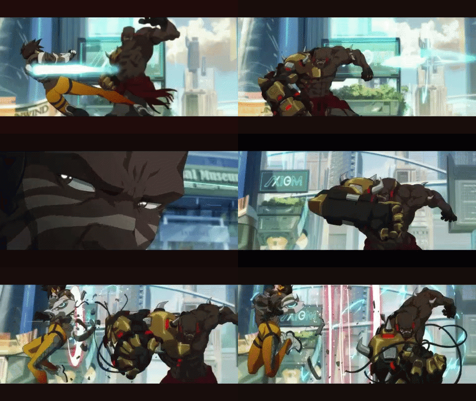
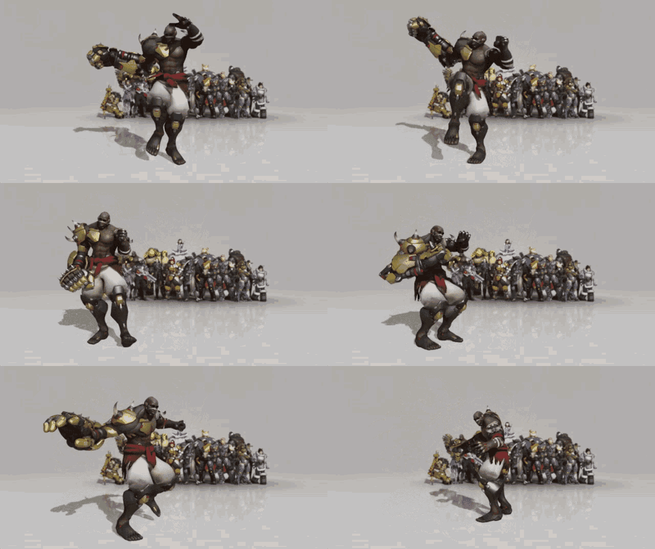
Doomfist was supposed to be Overwatch's Thanos but you'd barely know that considering how goofy he acts in game and how bad his kit is.

The difference between this:

come-over-here-punch.gif


And this:

overwatch-doomfist.gif


...felt as deflating as when Star Wars had the very dark and serious Tartakovsky Clone Wars series which was then replaced with a 3D series that felt more like a Saturday morning cartoon than the actual cartoon that came before it.

This is Concord following a formula that was already laid out for them by Blizzard, faults and all.

Other than that I agree with the rest of your points.
 
Last edited:

Men_in_Boxes

Snake Oil Salesman
Overwatch had this same problem every time they released a new PvE event around lore, with a good example of this being the Blackwatch event.

Doomfist was supposed to be Overwatch's Thanos but you'd barely know that considering how goofy he acts in game and how bad his kit is.

The difference between this:

come-over-here-punch.gif


And this:

overwatch-doomfist.gif


...felt as deflating as when Star Wars had the very dark and serious Tartakovsky Clone Wars series which was then replaced with a 3D series that felt more like a Saturday morning cartoon than the actual cartoon that came before it.

This is Concord following a formula that was already laid out for them by Blizzard, faults and all.

Other than that I agree with the rest of your points.

One big difference between Overwatch and Concord (story wise) is that Overwatch always placed the emphasis on character and not the world.

Concords space fairing theme, landing on different planets, visiting different cities and remote outposts, lends itself better to a different game type altogether. I never played Overwatch thinking "Oh how I wish I could explore this generic sci fi background". With Concord, they're teasing us with that concept.
 
Last edited:
One big difference between Overwatch and Concord (story wise) is that Overwatch always placed the emphasis on character and not the world.
Fair point.
Concords space fairing theme, landing on different planets, visiting different cities and remote outposts, lends itself better to a different game type altogether. I never played Overwatch thinking "Oh how I wish I could explore this generic sci fi background". With Concord, they're teasing us with that concept.
This sounds more like a map problem. Overwatch maps made you feel like you were deep within each city location. Looking out into the distance of each background you can see little things, life, crowds, vehicles running by, etc. The maps so far in Concord feel like a tiny morsel of a location that you aren't even sure what it represents and there's not much in the background that helps you feel a sense of place.
 

Danjin44

The nicest person on this forum
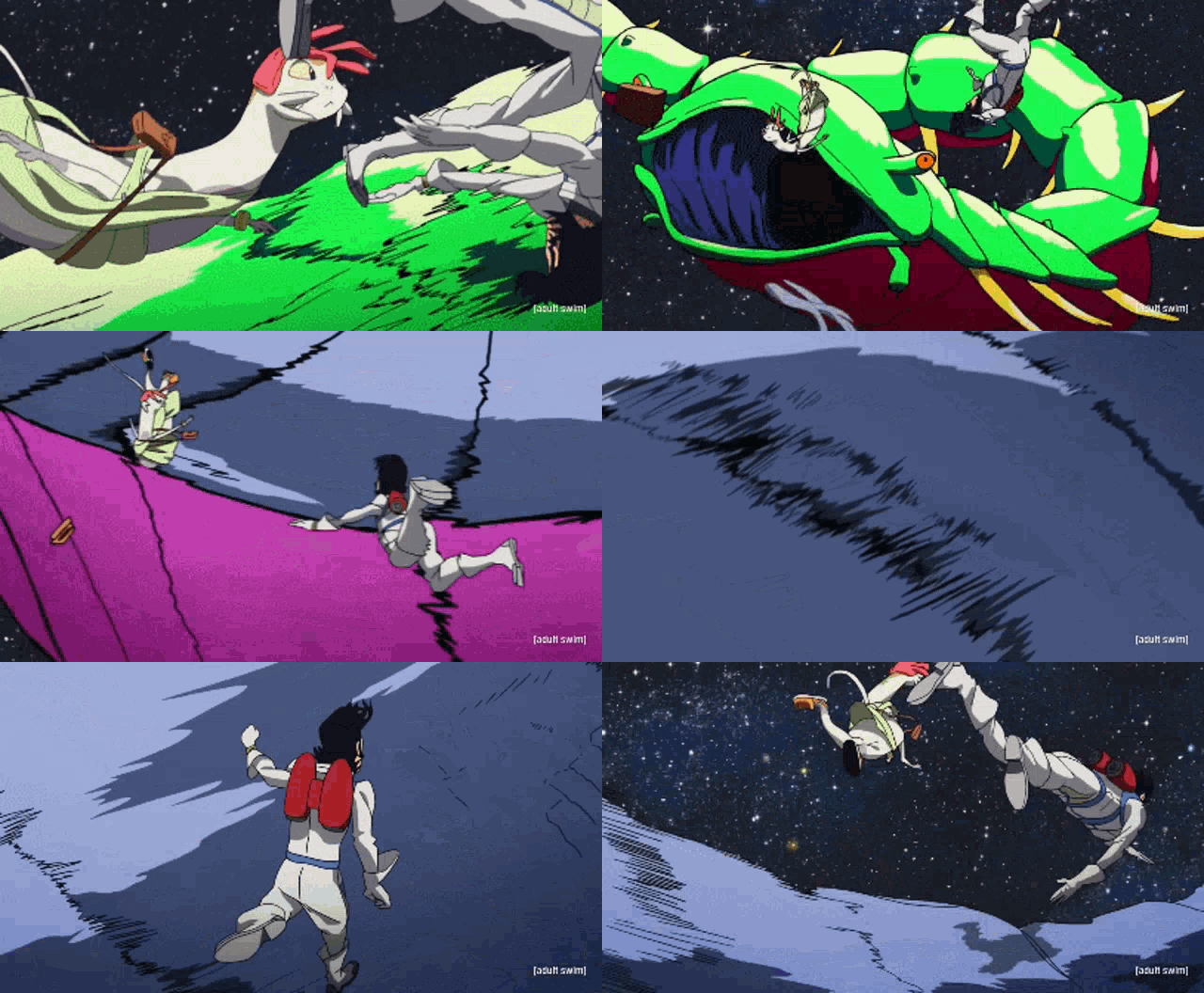
Space Dandy also had it's own really high level of animation to go along with it's zany ideas.

space-dandy-anime.gif
Yup, BONES did fantastic job with this show.

Meanwhile this one has 3D animation isn’t all that great and this colours doesn’t make it all that attractive.
 
Last edited:
It-Z is the only character in this whole roster that looks interesting and cool...

But again, nobody wants to buy a Street Fighter game where 29 out of the 30 characters are Blanka with different wigs, and ONE character is Makoto.


Also, the devs of Concord will address you at some point, Men_in_Boxes Men_in_Boxes
You put more thought and consideration into this game then literally anyone on Earth.

And I'm not making fun of you, I genuinely respect your dedication.
 
Yup, BONES did fantastic job with this show.

Meanwhile this one has 3D animation isn’t all that great and this colours doesn’t make it all that attractive.
It's not that it's not great, it's that it's just polished and that's all. They didn't try to go for something more in regard to it's art style. They didn't try to go too off-the-wall with it's designs.

It's very inspired-but-familiar design. Compare the designs in this game to some of the craziness seen in the game High On Life.
 

diffusionx

Gold Member
When it was first shown, I was confused at how they tried to show this team of characters that conducted missions by... Fighting identical characters in a round-based arena? Shit makes NO SENSE.
 

ResurrectedContrarian

Suffers with mild autism
The colour-scheme reminds me of another "queer-oriented" "game":


In other words, it can fuck right off.


In fact, it always carries those intentional undertones, and is particularly prevalent now in any media that strikes a line between being marketed to children and containing heavy suggested or explicit "queer" elements.

She-Ra, for example
MV5BMTc4NTYxODU3M15BMl5BanBnXkFtZTgwNzgzODI5NTM@._V1_.jpg


You can recognize it a mile away, and if you check out a game or show with these colors, you'll find exactly what you expect in the characters and themes.
FvOv4Fl.jpeg
 

Wildebeest

Member
I think that ludonarrative dissonance is often just bs that chattering classes talk about but don't really care about when it comes to playing games. Most players are able to context switch between a format that is supposed to tell you what a character is about and a gameplay format.

The biggest structural problem with their trailers is character reveal pacing. Everything just seems so rushed, and the characters appear to have zero depth. Maybe, in reality, their characters are really about as shallow as you can get, so they have no alternative.
 
Neat short, It-Z looks so much better here than in the actual game.

And this is like, one of the better character designs in Concord compared to almost everyone there.
That said, weren't you complaning that there were too many threads bashing the game?


Reminds me of Telsa, from the comic Descender. She's a great character, written by a real pro, unlike the one in Concord. Studios need to start hiring good writers at once.

nnCEvq4.jpeg
 
Top Bottom