You are using an out of date browser. It may not display this or other websites correctly.
You should upgrade or use an alternative browser.
You should upgrade or use an alternative browser.
The worst HUD design you've ever seen
- Thread starter The Infectious Paradox
- Start date


LectureMaster
Has Man Musk
No one beats WoW in this regard, lmao.

notseqi
Gold Member


Last edited:
Shadowstar39
Member
Civ 7, - its not intuitive, and missing so much. Its bear bones. Going into the speerate screens feels like its missing labels and context. There is limited help no mouse overs, like it was designed for consoles instead of pc (because it was, first civ to do this) . Also the side new info board on the right doesn't update it gives the same info over and over. How many times do I need to know that Trung Track (don't even know who she is) has taken over Carthage?

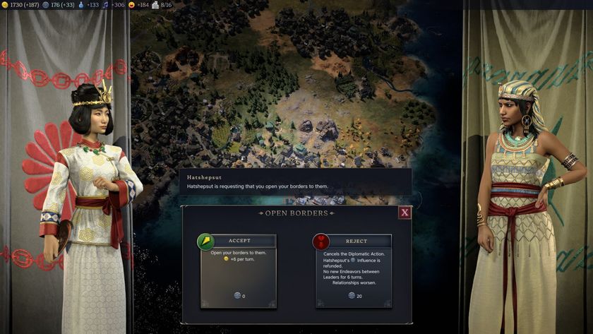
Here is the diplomacy screen:
It doesn't give you many options, normally there are 3 options, spend influence and both get something, don't spend influence but let the other person go a head and they make out or reject and loose repulation. There is no other options when being, what feels like extorted. It's very limiting. The city states menu is too.
Here is civ 6 for comparison:
Way more info, better looking ui with borders, and mouse overs.

Here is civ 5:
Notice again, clear borders and this one had an art deco ui. Way more buttons and information. Look at the recent events on the right, it has details beyond a picture.

Civ 4 ui: see the theme.
All continued as this until civ 7.

I won't go into civ 1- 3 as they were not 3d, but even still those games I can still jump in and get up to speed. In fact I just recently did that with civ 2 to see how much it has changed since 1996. Civ 2 has better ui than civ 7.
Here is the diplomacy screen:
It doesn't give you many options, normally there are 3 options, spend influence and both get something, don't spend influence but let the other person go a head and they make out or reject and loose repulation. There is no other options when being, what feels like extorted. It's very limiting. The city states menu is too.
Here is civ 6 for comparison:
Way more info, better looking ui with borders, and mouse overs.
Here is civ 5:
Notice again, clear borders and this one had an art deco ui. Way more buttons and information. Look at the recent events on the right, it has details beyond a picture.
Civ 4 ui: see the theme.
All continued as this until civ 7.
I won't go into civ 1- 3 as they were not 3d, but even still those games I can still jump in and get up to speed. In fact I just recently did that with civ 2 to see how much it has changed since 1996. Civ 2 has better ui than civ 7.
Shadowstar39
Member
What am I looking at here? Is that some sort of lego gta 5 mod? Wtf...lol

Also Diakatana was just bad in general. That game had more issues than the ui, i think while bad was the least of the problems. lol
Grildon Tundy
Member
So much more interesting when there is in-world feedback to indicate how damaged they are. Like in Binary Domain where parts of the robots fall off, or Kingdom Come Deliverance 2 when they start huffing and puffing, bleeding and hunched over.Hmm not actually the whole HUD but i really dislike enemies hp bars hovering over their heads, very distracting.. and BioShock 1 and 2 didn't had an option to turn it off, so does Avowed.
kevboard
Member
So much more interesting when there is in-world feedback to indicate how damaged they are. Like in Binary Domain where parts of the robots fall off, or Kingdom Come Deliverance 2 when they start huffing and puffing, bleeding and hunched over.
Parts falling off of the robots in Binary Domain aren't meant to be damage indicators as such, they are strategically relevant. depending on what you shoot off of an enemy, the AI will react differently.
shoot their legs off and they stop shooting but will crawl, shoot their heads off and they will randomly shoot around and hit other robots, shoot their weapon arm off and they will try to grab a weapon off of the ground.
so yes they show that you have damaged an enemy, but they aren't a replacement for a health bar.
Last edited:
ChorizoPicozo
Member
probably 90% of mobile games
Grildon Tundy
Member
Makes it even better. Also, it's been a while since I played, but doesn't it follow logic like if you take out all their limbs, then they dead?Parts falling off of the robots in Binary Domain aren't meant to be damage indicators as such, they are strategically relevant. depending on what you shoot off of an enemy, the AI will react differently.
shoot their legs off and they stop shooting but will crawl, shoot their heads off and they will randomly shoot around and hit other robots, shoot their weapon arm off and they will try to grab a weapon off of the ground.
so yes they show that you have damaged an enemy, but they aren't a replacement for a health bar.
kevboard
Member
Makes it even better. Also, it's been a while since I played, but doesn't it follow logic like if you take out all their limbs, then they dead?
I haven't played it in a while either, but if I remember correctly, if you shoot down 2 body parts (leg + arm, leg + head, head + arm) they are dead. but you can also just aim straight for their torso and kill them through enough damage.
Last edited:
panda-zebra
Member

March Climber
Member
It will never be that simple. The game itself has to be built around a No-UI option for it to be beneficial, or else the user is constantly opening up the pause screen to check for things that are not being shown or directed to them in-game.it only looks so bad because of all the shit added to it.
and you can disable pretty much everything. choice is good.
Quick example:
A game not built around it's UI: An NPC character will give you context clues or directions in order to get to a location "Go straight, make a right at this stop, walk 10m, turn left, run 30m, etc"
vs
A game built around it's UI: An NPC character will say "You can find this location here" *Compass marker is now active on the screen along with text on the right to guide you*
somesang
Member
Hard disagree. My only complaint is the MFD, which I understand why it's set up that way on a control level, but having to scroll through to get that info sucks. I'd argue it's one of the best racing HUDs out.GTS - GT7
But overall any HUD that takes up to much of the screen is bad.

And on top of that, you have options to display/hide race/car info.
Chuck Berry
Gold Member
I like Helldivers 2, but the HUD and map are just bad, imo

Welp, looks like Ill be skipping out on this one for good. Thanks for the simple convincing Toph lol

StreetsofBeige
Gold Member
Just about every UBI game has tons of HUD and stuff on screen.
Also, a generality about shooters. I hate when they put any numbers or +100 XP or Bingo! where you're aiming. Clutters the view. Put those info bits in the bottom corner log or be able to turn it off. One of those old Ace Combat games would say Bingo! right in the middle of the screen after every kill.
Also, a generality about shooters. I hate when they put any numbers or +100 XP or Bingo! where you're aiming. Clutters the view. Put those info bits in the bottom corner log or be able to turn it off. One of those old Ace Combat games would say Bingo! right in the middle of the screen after every kill.
snapdragon
Member
HOI4 has an excellent ui actually, the issue is when mods try to change the UI and the results are often disastrousHave you ever heard of a company called Paradox?
Syphon Filter
Member
what you really mean is the ux of this design, the ui means how it looks so the tc is correct.yeah i really don't see how this fucking mess is good UI. left and right far side never both in picture (besides UWS users) Top shows 6 pages. then Inventory is also several pages if needed and super clunky. And it needs to scroll up and down with super big boxes. Are you trolling? Because when i booted this game the first thing i tought of was.. holy shit this UI is clunky as hell
loving the game tho but UI ? hell nah

Fake
Member

Right here

balls of snow
Gold Member
Lol you can switch off most everything in the hud of Witcher 3. My first playthrough back in 2014 I just had the minimap, mission objective and healthbar during combat.
Even the notorious Assassins creed you can turn most of the babys first open world assists off. Look in at the options people.
Even the notorious Assassins creed you can turn most of the babys first open world assists off. Look in at the options people.
Synastry
Member
If PD would let you custom the HUD like PC2 it would be nice adding that feature shouldn't be hard.Hard disagree. My only complaint is the MFD, which I understand why it's set up that way on a control level, but having to scroll through to get that info sucks. I'd argue it's one of the best racing HUDs out.
And on top of that, you have options to display/hide race/car info.
Being able to display/hide race/car info is not good enough.
Kumomeme
Member
THIS.Metaphor: ReFantazio
Too overdesigned and distracting. Perhaps if the game natively supported ultrawide and properly spanned the HUD, it wouldn't be as bad, but having all of that shit flashing in the 16:9 window was part of the reason I stopped playing the game.
i fans of Persona 5 sleek design but Metaphor feels overboard at everything. trying to be too stylize than properly balance the space.
violence
Member
If modded Wow counts then it's unbeatable because it can be any level of bad. It's another dimension.No one beats WoW in this regard, lmao.
TerribleAtThisGame
Member
The upcoming Doom has one fugly-ass HUD based on recent footage. Completely clashes with the actual colors and just looks like some late 2000s shit to me.

TerribleAtThisGame
Member
GoW and modern Resident Evil games take this baffling "corporate presentation" approach that has zero personality and visually doesn't even attempt to fit in. I don't know why clean must mean eliminating any artistic flourishes that fit the mood. Demon's Souls Remake did the same thing.I remember Horizon: Zero Dawn having the worst inventory I've ever interacted with. Does that count?
If not, any modern game which UI is just white lines could qualify, there are tons of those. Just compare those two:
Bad UI. No personality and it looks dull. Just some white lines, fog and 2 models thrown in there:

Good UI, design matches the setting of the game and it also looks beautiful.

Edit: Skyrim's UI is fucking bad.
lughnasadh123
Member
EverQuest 1 where your screen is shrunken down with clutter all around it.
Syphon Filter
Member
late 2000 has way better hud design than modern games.The upcoming Doom has one fugly-ass HUD based on recent footage. Completely clashes with the actual colors and just looks like some late 2000s shit to me.
Last edited:
TerribleAtThisGame
Member
I was thinking more like a low budget local yokel Nu Metal band logo from that era.late 2000 has way better hud design than modern games.
ShaiKhulud1989
Gold Member
Stellaris became simply unbearable.HOI4 has an excellent ui actually, the issue is when mods try to change the UI and the results are often disastrous
Trunx81
Member
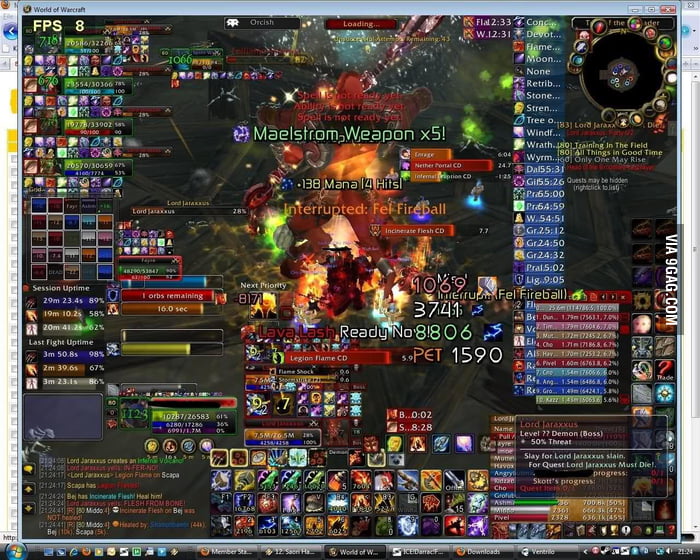
This is one of the greatest gifs that ever existed.
This hurts on so many levels. Window mode? Windows Vista? 8fps?
LavitzSlambert
Member
I remember Horizon: Zero Dawn having the worst inventory I've ever interacted with. Does that count?
If not, any modern game which UI is just white lines could qualify, there are tons of those. Just compare those two:
Bad UI. No personality and it looks dull. Just some white lines, fog and 2 models thrown in there:
Good UI, design matches the setting of the game and it also looks beautiful.
Edit: Skyrim's UI is fucking bad.
Somehow GOWR's is worse. If we are going UI rather than strictly HUD, I want to call out our boi

Come On Tars
Member

Populous on snes. This is the answer. No one knew what the fuck was going on in the game. We just made some hills, got confused and died. Music was sick
BigLee74
Member
Is that for real?No one beats WoW in this regard, lmao.
Paasei
Member
If you use a fuckton of addons and you don't properly personalise the HUD when installing those, then yes.Is that for real?
If you only use the HUD the game provides the WoW HUD is fine. Not the best, but very far away from those posted screenshots.
In todays version of WoW the standard WoW HUD looks like this:

Sadly I cannot find a screenshot of the classic WoW version that only uses the default HUD. In that screenshot you replied to full of addons the spell bar (on the bottom in the middle) is standard, but it's scalable. The only part of the bottom that isn't standard is the text on the far bottom saying "Master loot" all the way to his gold count.
Everything else besides that spell bar is there because of addons that person downloaded.

GymWolf
Gold Member
One of the reasons why i don't play mmorpg.
Last edited:
Spukc
always chasing the next thrill
Yes but it's player addons..Is that for real?
BlackTron
Gold Member
BOTW's UI was good in how much of the screen it took up and how it could be turned off. It had some weird decisions that made the pause menu clunky. The quick menu was ok but had its own issues. TOTK refined some of BOTW's errors but added new ones, and it became a critical flaw of the game for me because it called upon you to constantly manage your inventory and select things from menus that even BOTW didn't mandate.
You can't even shoot a few elemental arrows in this game without it grinding to a complete halt to scroll to the right item to stick to the arrow every time. Your most used items moving to the top of the list would have helped. In one word it's honestly just bad. I started taking the path of least menu resistance instead of what I'd think of to try doing.
If TOTK had launched on Switch 2, the mouse-cons could have alleviated the finicky building controls. I don't hate them per se but I got pretty tired dealing with it over the whole game. Actually, this makes me realize that the shoulder button really ought to double as a scroll wheel.
rodrigolfp
Haptic Gamepads 4 Life
WoW HUD can be anything you want. Even nothing.One of the reasons why i don't play mmorpg.
Holammer
Member
Everyone posts terri-bad WoW meme images. Here's what late game vanilla wow looked like for a healer back in the days. It's not completely insane and pretty readable, in the expansion they reduced raid sizes from 40 to 25 which made it more manageable too. Socially and UI wise.
DPS classes would trim it down considerably with only a DPS meter taking up half the screen.
Also notice the 5:4 aspect ratio, we must go back! Wide was a mistake!

DPS classes would trim it down considerably with only a DPS meter taking up half the screen.
Also notice the 5:4 aspect ratio, we must go back! Wide was a mistake!