Benjamin1981
Member
The USB Keyboard is now 50 dollars/euros. Pretty expensive.
Laurent said:Installing them will replace the old ones... Pretty much every Apple apps is set to upgrade old stuff, and clean everything afterwards...
There there, why the gloomy face?Hitokage said:Haha, man, so that keyboard layout wasn't fake.
Draft said:Goddamn it when will the PC industry's ill advised war on the numpad end?
Benjamin1981 said:The USB Keyboard is now 50 dollars/euros. Pretty expensive.

If by old keyboards you mean anything that's USB or Bluetooth, then yes.Would you be able to use the old keyboards still with the new macs?
I know shit nothing about apple computers.

sportzhead said:
I like it a lot.

sportzhead said:
I like it a lot.
i think we got that when you said it on page 1, 2, 3, and 4.pxleyes said:God damn thats ugly. WTF Apple with the glossy screen. The nested rounded rectangle look is too much like a webpage for me, especially with such a harsh contrast like the black. The black really adds nothing to the whole design.
I have not lived the same experience, everything was flawless and there was no compatibility issue with my projects whatsoever...mrkgoo said:In my experience, that isn't true. If you install over old versions of ilife o5, for example i DVD, old projects aren't compatible if you delete the old app first. I think software like idvd6 actually just add things into the existing idvd5 app - a 'fresh' install appears to delete things idvd 5 needed, where as installing over the old one adds things making the app huge.
It's simple yes, but far from 'clean'.
sportzhead said:
I like it a lot.
6.8 said:i think we got that when you said it on page 1, 2, 3, and 4.
pxleyes said:Well that was an inevitable response. Why don't you say the same thing to those who like it.
sportzhead said:
I like it a lot.
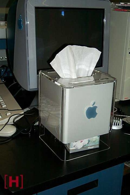
Blasphemy said:This will go down (along with the G4 cube) as one of Apple's worst design decisions.
pxleyes said:God damn thats ugly. WTF Apple with the glossy screen. The nested rounded rectangle look is too much like a webpage for me, especially with such a harsh contrast like the black. The black really adds nothing to the whole design.
cjdunn said:Pretty except for those black borders. Why-why-why!? The LCD panel does need that much.
shantyman said:WTF, the Cube was their best ever design.
sportzhead said:http://www.blogsmithmedia.com/www.engadget.com/media/2007/08/new-imac-keyboard-17.jpg
I like it a lot.
HEY! I am using mine as a web server! Has worked around the clock, 24/7 since 2000...Blasphemy said:A design disaster of epic proportions (not to mention all the things which went wrong with it *because* of the design)
shantyman said:Issues? The only real issue was with the solid state button (which I never experienced).

