• Hey, guest user. Hope you're enjoying NeoGAF! Have you considered registering for an account? Come join us and add your take to the daily discourse.

Is Horizon Forbidden West: Burning Shores the Best Looking Game Ever?

Is Horizon Forbidden West: Burning Shores the Best Looking Game Ever?

  • Yes

    Votes: 125 33.0%
  • No

    Votes: 108 28.5%
  • Maybe

    Votes: 47 12.4%
  • Red Dead Redemption 2 is Still King

    Votes: 36 9.5%
  • Cyberpunk 2077 Overdrive Mode FTW

    Votes: 60 15.8%
  • Other (Specify in the Comments)

    Votes: 3 0.8%

  • Total voters
    379
gallery-is-horizon-forbidden-west-burning-shores-the-best-looking-game-ever-1.large.jpg


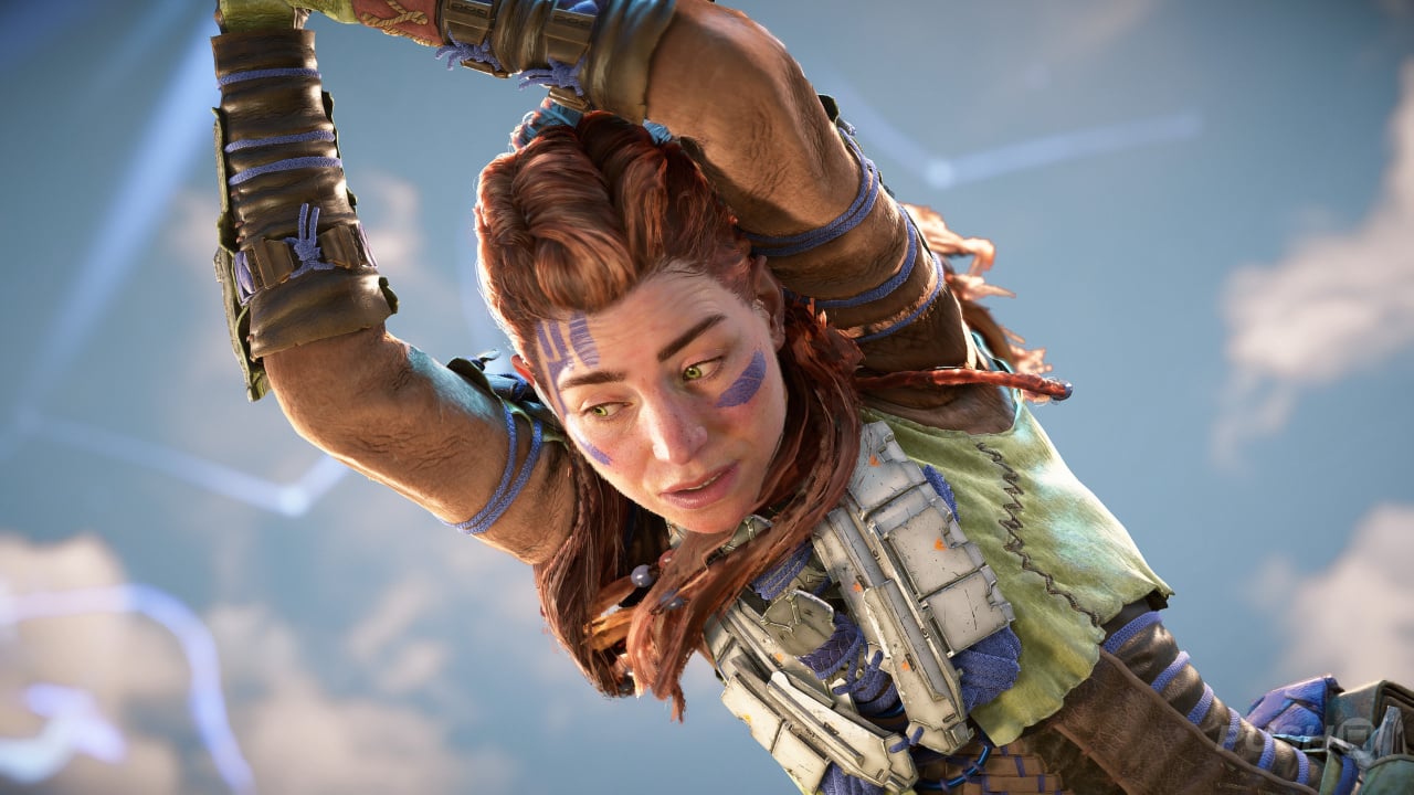
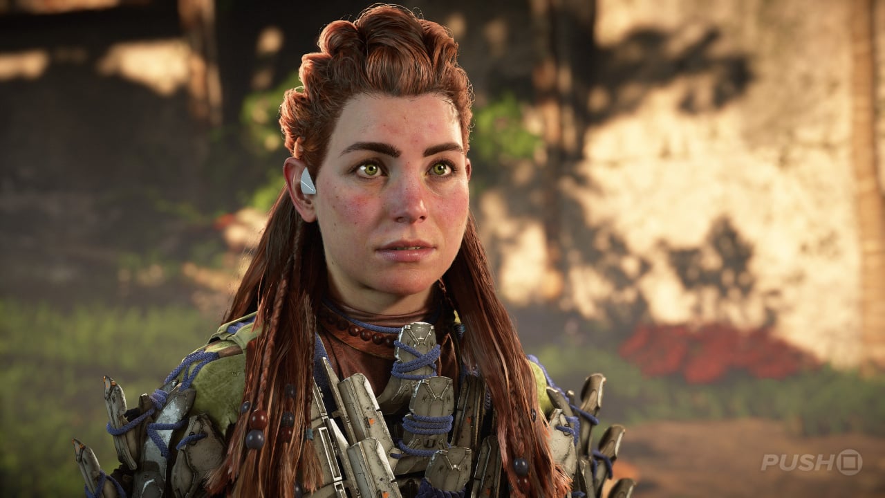
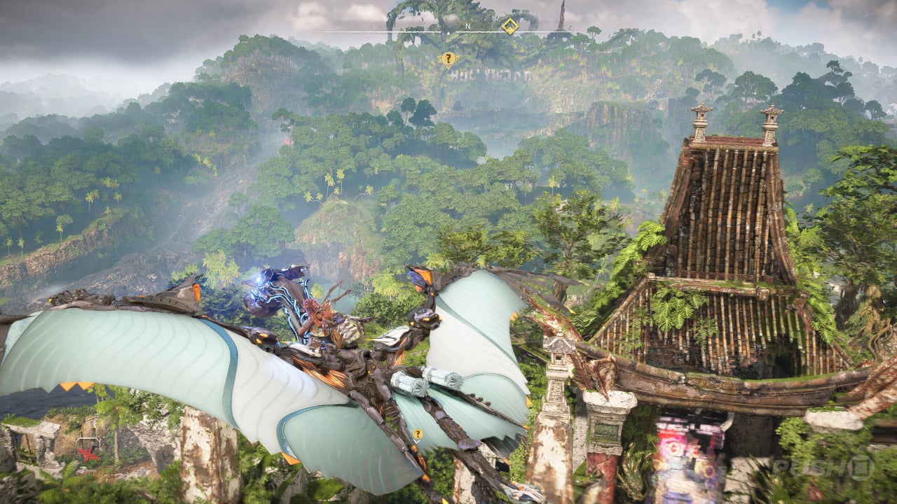
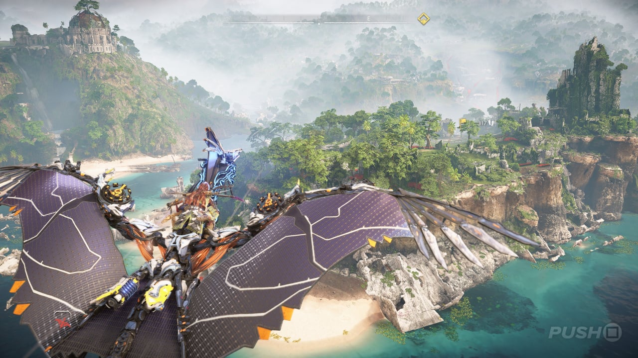
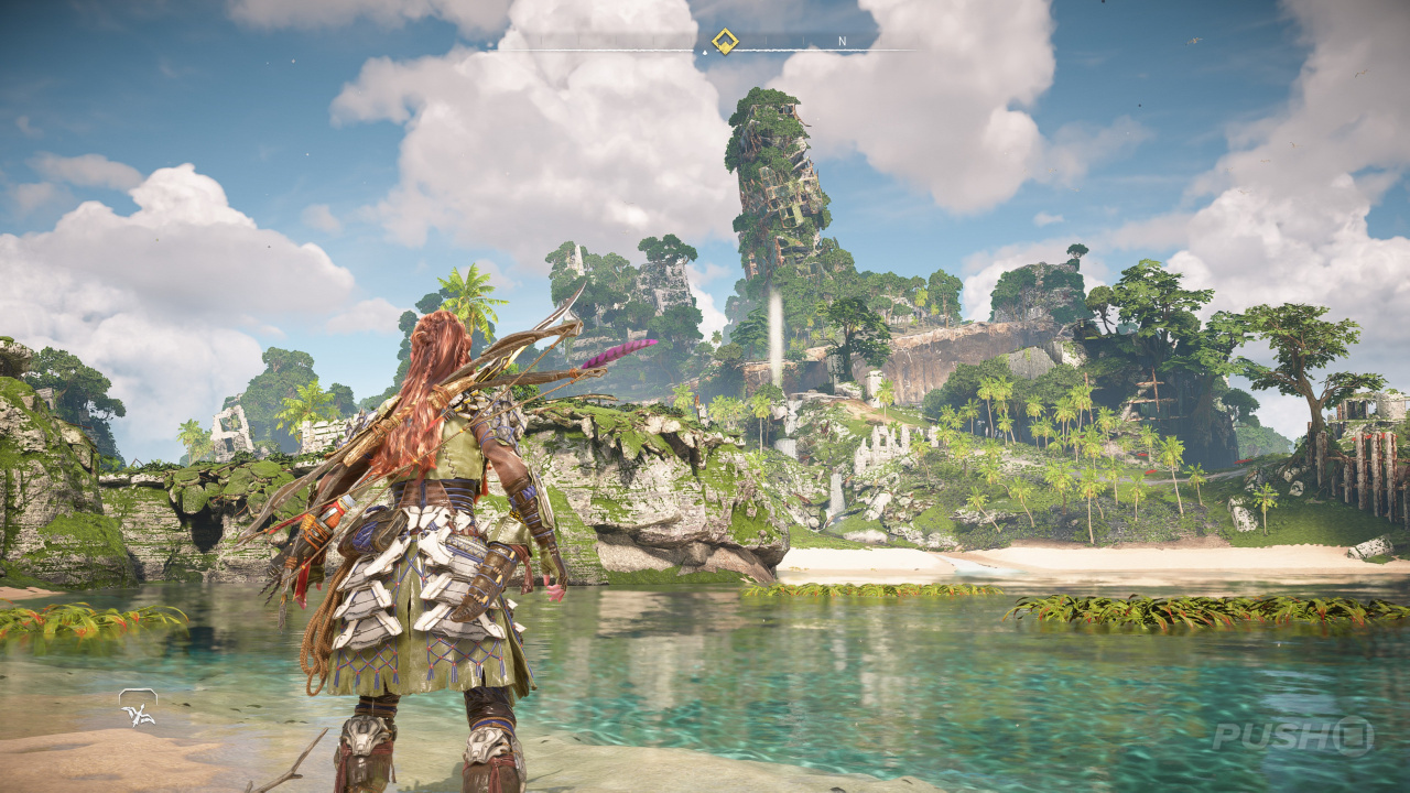
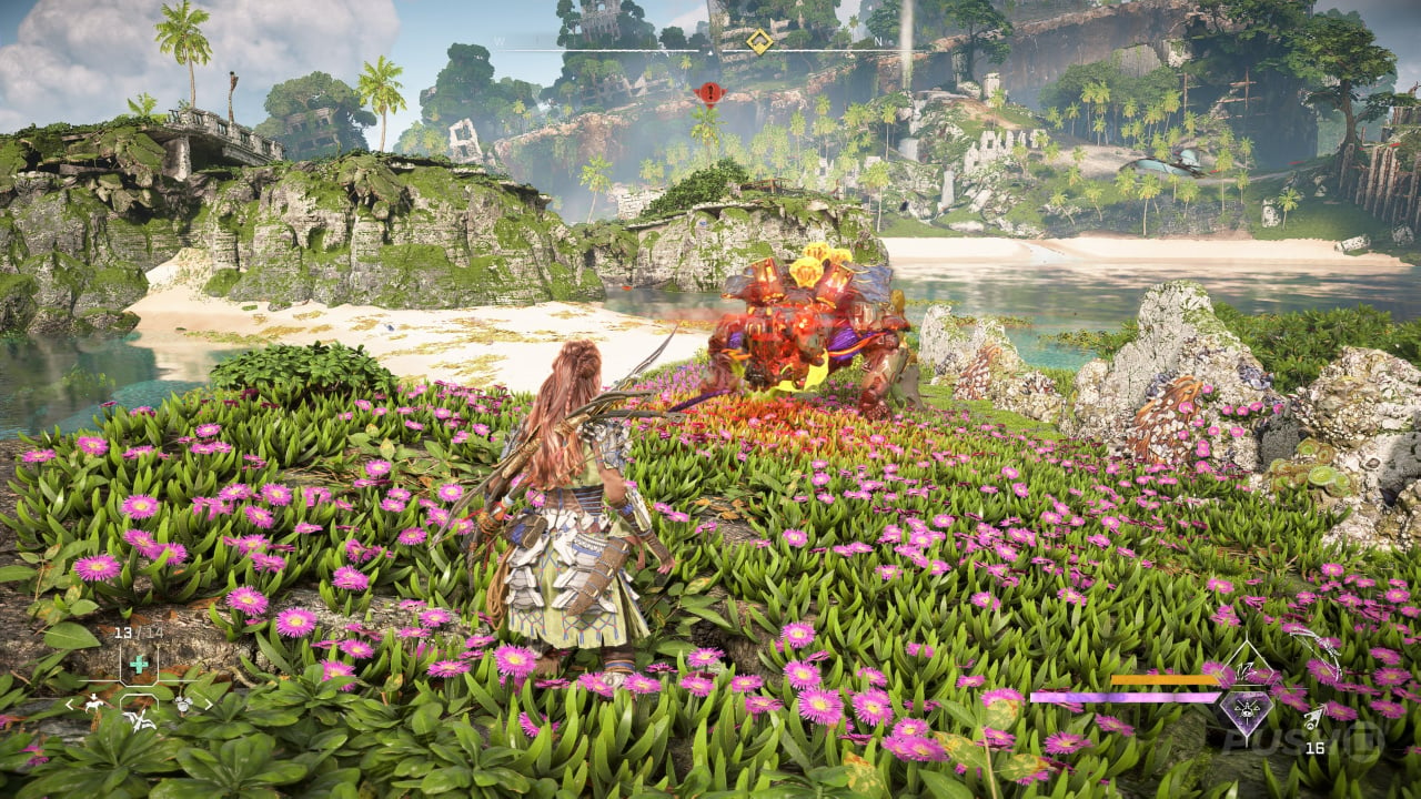
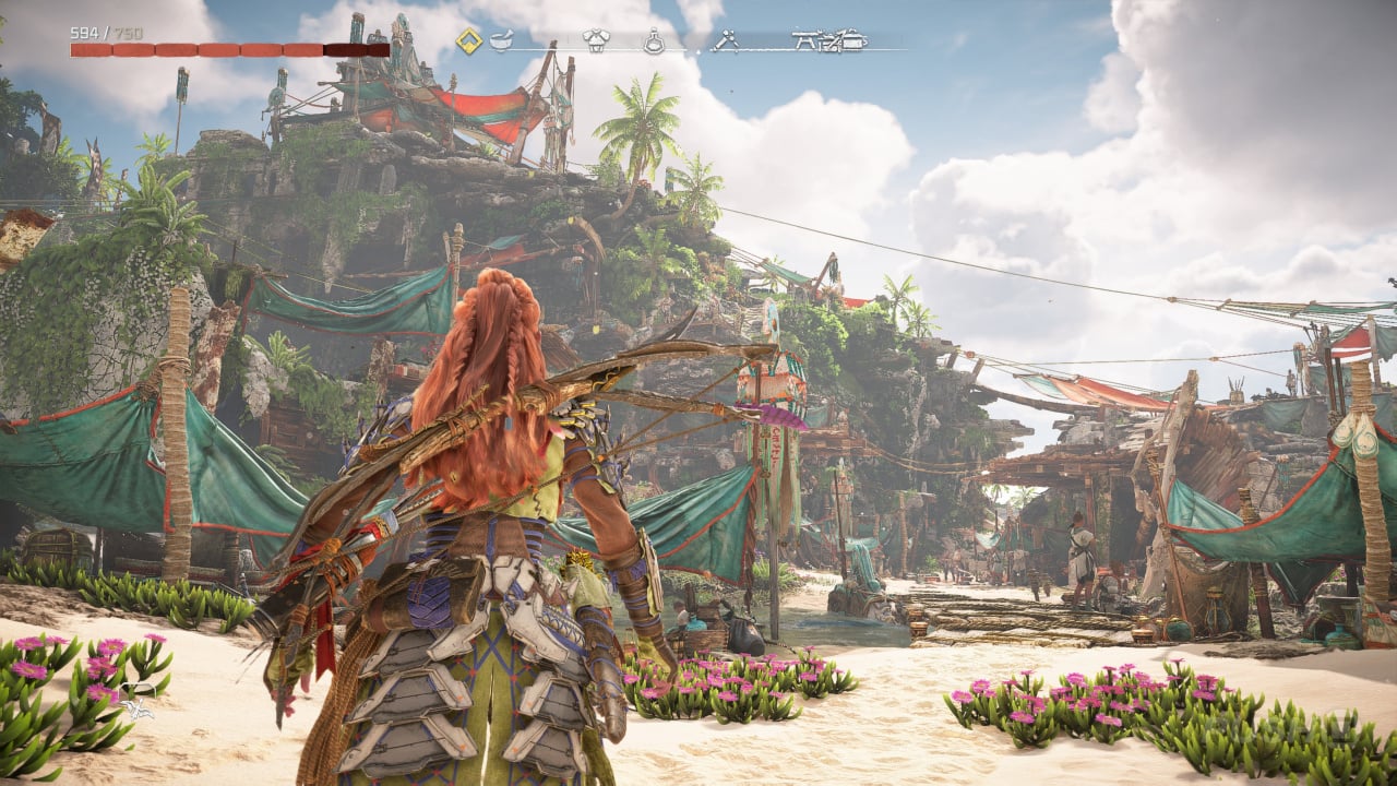
Horizon Forbidden West: Burning Shores is out exclusively on PS5, and, let's cut to the chase, it looks magnificent.
gallery-is-horizon-forbidden-west-burning-shores-the-best-looking-game-ever-2.large.jpg

gallery-is-horizon-forbidden-west-burning-shores-the-best-looking-game-ever-4.large.jpg

gallery-is-horizon-forbidden-west-burning-shores-the-best-looking-game-ever-3.large.jpg

gallery-is-horizon-forbidden-west-burning-shores-the-best-looking-game-ever-5.large.jpg


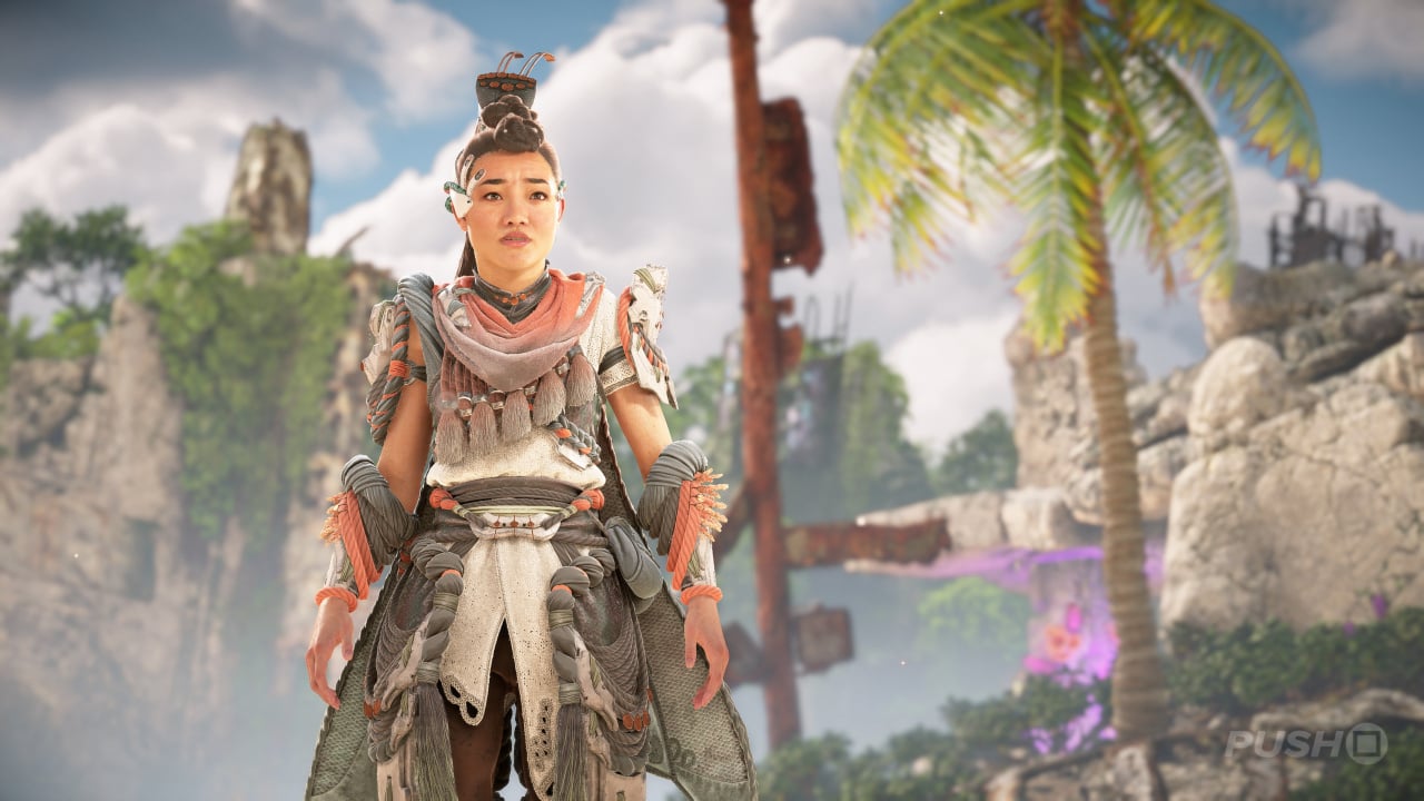
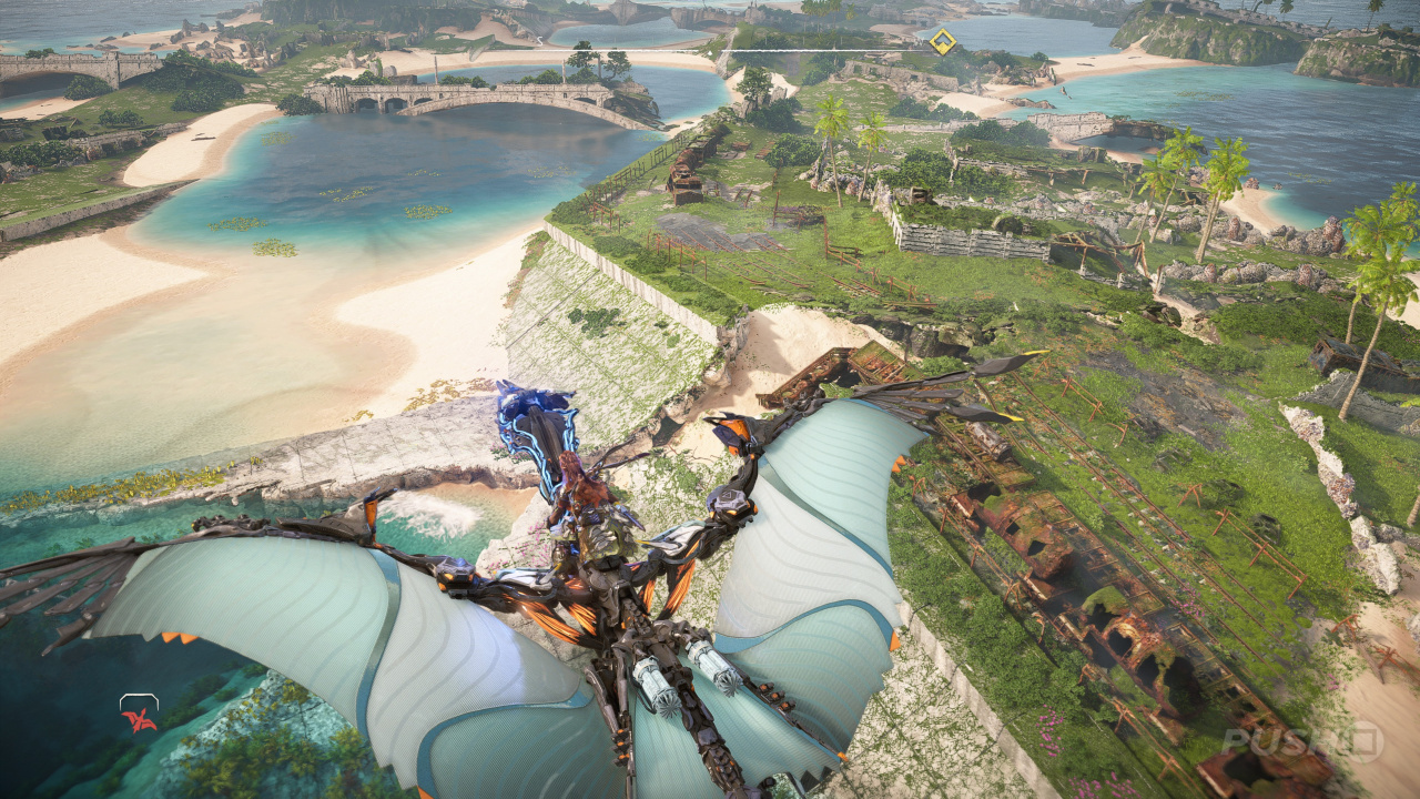
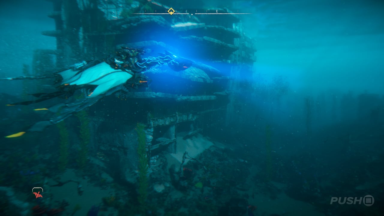
Of course, it's based upon the already stunning main game, but there's something about Burning Shores that really pops. The varied colours and textures found in the environment, the lighting, the brilliant character models — it all adds up to what might be the best-looking game on PS5.
gallery-is-horizon-forbidden-west-burning-shores-the-best-looking-game-ever-6.large.jpg

gallery-is-horizon-forbidden-west-burning-shores-the-best-looking-game-ever-8.large.jpg

gallery-is-horizon-forbidden-west-burning-shores-the-best-looking-game-ever-7.large.jpg

gallery-is-horizon-forbidden-west-burning-shores-the-best-looking-game-ever-10.large.jpg


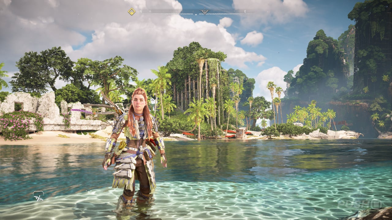
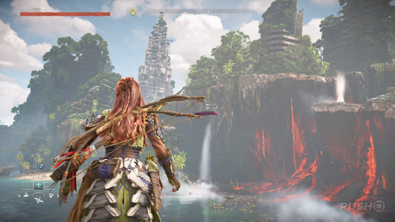
We've captured a good amount of screenshots here, some taken from cutscenes (which play out in-engine) but most are raw gameplay snaps. It's more proof that, when Sony's first-party teams are firing on all cylinders, they often deliver some of the best visuals in the business.
gallery-is-horizon-forbidden-west-burning-shores-the-best-looking-game-ever-11.large.jpg

gallery-is-horizon-forbidden-west-burning-shores-the-best-looking-game-ever-12.large.jpg

gallery-is-horizon-forbidden-west-burning-shores-the-best-looking-game-ever-13.large.jpg


Fbh

Member
I'm not really seeing any obvious improvements over the base game in those screenshots.
But Forbidden West in general is one of the best looking games ever. The fact it still looks amazing while running at locked (or near locked) 60fps on a $400 console is even more mindblowing.

Cyberpunk in overdrive mode might have a slight advantage in environments, but the character models aren't even close
 

rofif

Can’t Git Gud
Do unreleased games count? This is it for me:


For released games, I'm going to say Cyberpunk with the new path-tracing update.

No offense to Horizon--it's a real looker.

It’s just a one scanned garage
Ceberpunk looks worse still despite its seemingly more impressive tech
 
It’s just a one scanned garage
Ceberpunk looks worse still despite its seemingly more impressive tech
It's the most realistic garage I've ever seen. I'm guessing you and I interpreted the OP title differently. I took it as "realistic", but I could see how something else could be "better looking".
 

ZehDon

Member
Not for me.

The hyper-stylised "hero lighting" they insist on using in their cut scenes looks atrocious, making sure any attempts at immersion is broken immediately. It reminds me a lot of the "crushed blacks" non-sense that was built into the Xbone at launch, where a lot of people actually liked it because, generally, people think higher contrasts make the details "pop". The game's art-style has also never really worked for me, either, feeling extremely generic despite all of the details crammed in. I find it difficult to articulate, but despite the art technical and artistic effort that's clearly on display in the Horizon games, they all just feel... empty. Hollow. In the Assassin's Creed kind of way. You know what you're seeing has all of the "right elements", but, for some reason, it just doesn't feel impressive. It comes across as visual "meh". It's curious.
 

Gaiff

SBI’s Resident Gaslighter
Definitely a candidate. I know not everyone likes the art style but I think it's fantastic.

As for Cyberpunk, while it is overall technically more advanced on PC, I simply cannot get over these ugly NPCs. They're Oblivion level of bad and actively detract from the experience. When you marvel at Night City's architecture, cars, neon lights, and streets, everything takes a backseat the moment you see one of those god-awful NPCs shuffling about. I know it's not exactly fair because Horizon's NPCs aren't randomly generated so they're a fair bit more polished than in Cyberpunk and there is probably like 1/10th the population but this is a place where I feel that CD Projekt Red should have invested more. The NPCs in GTA IV look better and are better animated and I'm not being hyperbolic there. The NPCs are Cyberpunk's greatest visual sin and they're IMPOSSIBLE to ignore since they take such a large chunk of the game. If they looked even halfway decent, it would be by a wide margin the best-looking game but as it stands, it's just too visually inconsistent for my taste.
 

BennyBlanco

aka IMurRIVAL69
Definitely a candidate. I know not everyone likes the art style but I think it's fantastic.

As for Cyberpunk, while it is overall technically more advanced on PC, I simply cannot get over these ugly NPCs. They're Oblivion level of bad and actively detract from the experience. When you marvel at Night City's architecture, cars, neon lights, and streets, everything takes a backseat the moment you see one of those god-awful NPCs shuffling about. I know it's not exactly fair because Horizon's NPCs aren't randomly generated so they're a fair bit more polished than in Cyberpunk and there is probably like 1/10th the population but this is a place where I feel that CD Projekt Red should have invested more. The NPCs in GTA IV look better and are better animated and I'm not being hyperbolic there. The NPCs are Cyberpunk's greatest visual sin and they're IMPOSSIBLE to ignore since they take such a large chunk of the game. If they looked even halfway decent, it would be by a wide margin the best-looking game but as it stands, it's just too visually inconsistent for my taste.


7025-F175-058-B-4533-BEA7-B02-BD91-F7-B68.jpg
 

Aenima

Member
Havent played the expansion yet, but none of those screenshots even look better than the base game in motion. And yes to me HFW was already the best looking game i played so far.
 
Asset and model quality especially are amazing.... But after CP2077 this just looks flat and fake.... And yes, considering the difference in hardware requirements that is an unfair comparison.
 

Gambit2483

Member
I can’t tell the improvements with the graphics playing it compared to the first game aside from the clouds? Is there something I’m missing?
KAwAbS9.gif


It is significantly improved from the first game. In the first game you couldn't even swim underwater. Seriously everything dealing with the water and sky has been vastly improved from the original.

Also, the character models and animations for the NPCs are on a completely new level. Do yourself a favor and look up some comparison videos on YouTube (though not the true ideal way) to see the differences between both games
 
Last edited:
KAwAbS9.gif


It is significantly improved from the first game. In the first game you couldn't even swim underwater. Seriously everything dealing with the water and sky has been vastly improved from the original.

Also, the character models and animations for the NPCs are on a completely new level. Do yourself a favor and look up some comparison videos on YouTube (though not the true ideal way) to see the differences between both games
We’re talking about burning shores right? I’m talking about forbidden west vs burning shores not vs zero dawn - I get how u read it that way tho cus I said “first game”. I meant forbidden west
 
Top Bottom