• Hey, guest user. Hope you're enjoying NeoGAF! Have you considered registering for an account? Come join us and add your take to the daily discourse.

Is Horizon Forbidden West: Burning Shores the Best Looking Game Ever?

Is Horizon Forbidden West: Burning Shores the Best Looking Game Ever?

  • Yes

    Votes: 125 33.0%
  • No

    Votes: 108 28.5%
  • Maybe

    Votes: 47 12.4%
  • Red Dead Redemption 2 is Still King

    Votes: 36 9.5%
  • Cyberpunk 2077 Overdrive Mode FTW

    Votes: 60 15.8%
  • Other (Specify in the Comments)

    Votes: 3 0.8%

  • Total voters
    379

Ansphn

Member
Guerrilla is a tech/art power house, but it is still missing a touch to elevate its games from great to phenomenal, imo. Plus, I am eager to see them flexing through a proper current gen project, freed from the constraints of the PS4. Possibly around 2026/2027? 🤔
What needs to be fixed? Have you played the DLC? Cause I think it fixed a lot of the problems from the main game.

Dude I took my flying mount literally up into the clouds and it was lightning inside the cloud. I was inside a damn cloud and I made my mount dive thousands of feet from the stormed/lightning cloud into a body of water as I continue to use my mount in the water like a boss. Nothing comes close.
 
Last edited:

Lethal01

Member
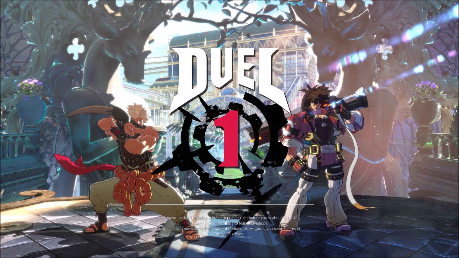
This one still looks better

ggstrive-beta-screenshot-april2020-3.jpg


Can't tell me you rather look at Aloy than Milia.:messenger_tears_of_joy:
 
Last edited:
It's the most graphically impressive game, yes. But it's not the best looking. Demon's Souls, Elden Ring are better looking games to me because the artstyle is so much better.

But the amount of vegetation Horizon renders is unmatched. Unreal technology they have.
 
Last edited:

Hestar69

Member
It might still be RDR2, but both look amazing. only thing about HFW is the story was BORING.. Is the dlc any better?
 
Last edited:

M1987

Member
I can’t tell the improvements with the graphics playing it compared to the first game aside from the clouds? Is there something I’m missing?
I'm playing Zero Dawn right now on PC and Forbidden West is on a completely different planet

Edit: just seen you meant compared to the base game,nvm
 
Last edited:

Puscifer

Member
Or you simply can't understand how different people have differing opinions and like different things than you.
I play Sony exclusives but damn dude, there's something really off about strictly limiting your enjoyment of this hobby strictly because there's a PS logo on the front and the die hard attitude towards it that clearly says "this is the best I have going for me"
 
I’m playing the base game again to see if I’d likely play the DLC and even without playing burning shores I’m very confident in saying no chance unless they have remade the game from the ground up.

The textures on the characters and dinos (and most of the environments) are absolutely top notch but the lighting model legit looks like something you’d see in a Ubisoft PS3 game. I get that 99.99% of games have faked lighting but it not normally so obvious.

Aloy is lit up like a Christmas tree no matter how dark it is, shadows are very low quality and pop in and out of view very close to the player giving you stuff like this at worst:


When you go from indoors to outdoors or vice versa the whole lighting style often changes dramatically before your eyes. Here are a few old videos but it's exactly the same now also look how Aloy looks superimposed on the gameplay rather than being a part of the level:


There are other things that annoy me like the excessive amount of clipping and the weird noodle looking hair but it’s mainly the lighting that makes the game look dated.

I get that it’s impossibly hard to do raster lighting with an open world game with dynamic(ish) time of day and pull it off to the level it tricks the player into thinking it is accurate but, again, it’s never normally so obviously fake.

Also despite seeing people saying they can’t tell the difference now between performance mode and quality mode it is still very obvious thanks to the smeary IQ in performance mode and the fact the checkerboarding destroys the quality of stuff like the glider and especially the volumetrics and particles effects like the holograms in Vegas.

The underlying art is very good and maybe even the best around and it is a real photo mode hero as you can zoom all the way in on the character models and they still look perfect but the overall package is too hit and miss. I’m sure the PS6 remaster that is fully path traced will look great but atm it is an incoherent mix of absolutely top end art and a basic bitch lighting model.
 

Bragr

Banned
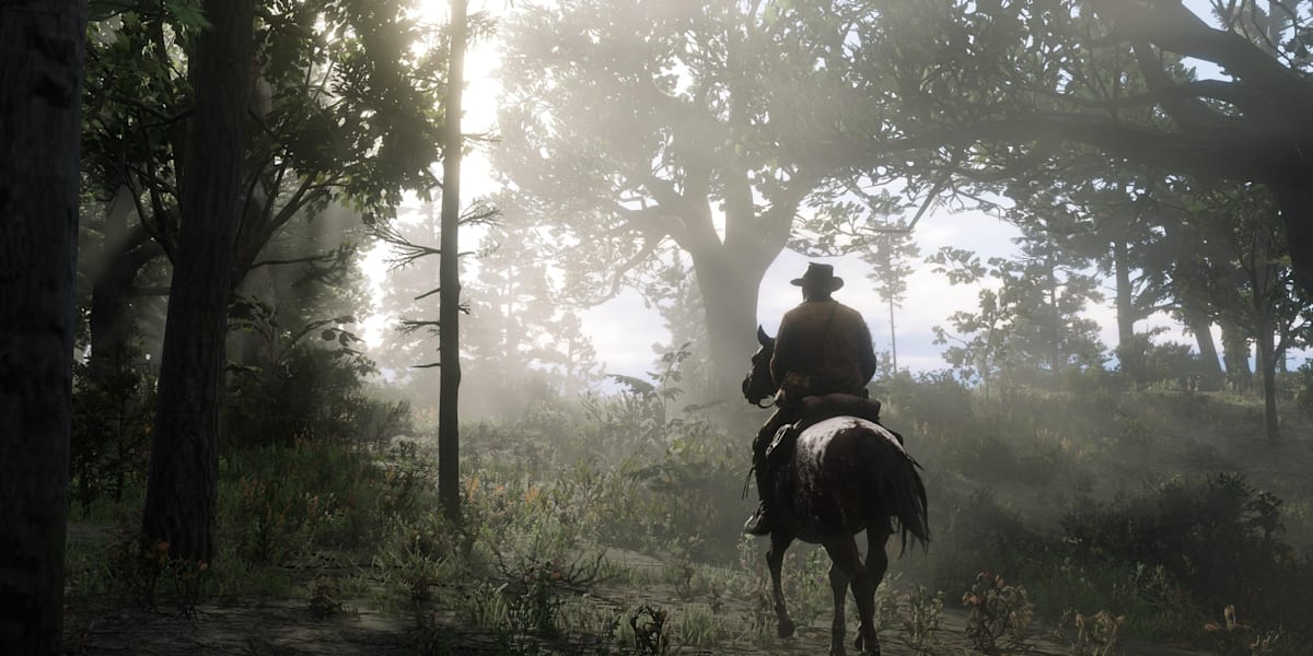
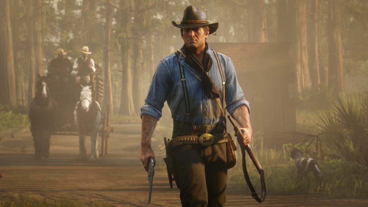
I can't understand the logic here, one thing is the tech, one thing is the art, but another thing is the art direction, and there is absolutely nothing in the industry rivaling Red Dead 2 in this department.

The mood, style, and vibe that is created in this game are second to none. There is no game with this level of quality from a visual perspective. There is more personality in the fog in Red Dead 2 than in the entirety of Horizon.

red-dead-redemption-2-hints


red-dead-redemption-2.jpg
 

rofif

Can’t Git Gud
s
I’m playing the base game again to see if I’d likely play the DLC and even without playing burning shores I’m very confident in saying no chance unless they have remade the game from the ground up.

The textures on the characters and dinos (and most of the environments) are absolutely top notch but the lighting model legit looks like something you’d see in a Ubisoft PS3 game. I get that 99.99% of games have faked lighting but it not normally so obvious.

Aloy is lit up like a Christmas tree no matter how dark it is, shadows are very low quality and pop in and out of view very close to the player giving you stuff like this at worst:


When you go from indoors to outdoors or vice versa the whole lighting style often changes dramatically before your eyes. Here are a few old videos but it's exactly the same now also look how Aloy looks superimposed on the gameplay rather than being a part of the level:


There are other things that annoy me like the excessive amount of clipping and the weird noodle looking hair but it’s mainly the lighting that makes the game look dated.

I get that it’s impossibly hard to do raster lighting with an open world game with dynamic(ish) time of day and pull it off to the level it tricks the player into thinking it is accurate but, again, it’s never normally so obviously fake.

Also despite seeing people saying they can’t tell the difference now between performance mode and quality mode it is still very obvious thanks to the smeary IQ in performance mode and the fact the checkerboarding destroys the quality of stuff like the glider and especially the volumetrics and particles effects like the holograms in Vegas.

The underlying art is very good and maybe even the best around and it is a real photo mode hero as you can zoom all the way in on the character models and they still look perfect but the overall package is too hit and miss. I’m sure the PS6 remaster that is fully path traced will look great but atm it is an incoherent mix of absolutely top end art and a basic bitch lighting model.

shadow bugs I can agree on but I love the hero lighting. If anything - The cinematic lighting should be on ALL THE TIME. I love this shit
 

UnNamed

Banned
No, but it's impressive nonetheless.

It has this strange effect with impressive characters and just "good" environments, probably because Guerrilla had less time to optimize the game on PS5, so they just pushed the characters and left everything else as is, with just few improvements.


So sonetimes it's like real people on the stage with fake backgrounds.
 

rofif

Can’t Git Gud
This "game" make me feel it's just a demo with just one environment because it's the only thing they can afford to make at the moment, so it's just that and no game around.
Because that's what it is. They scanned this one abandoned builing which is something that anyone can do. Everything is static.
And the aiming is just this lazy style where weapon moves first and body follows later. Like in Operation flashpoint but actually bad.
This would be a nightmare to play and aim
 

rofif

Can’t Git Gud
Played all of them apart from Callisto Protocol and I agree,but I would put Atomic heart in there
Atomic Heart looks good but nothing like the games.
Callisto is a looker but environmentally not as much.
 

simpatico

Member
Maybe in a blind technical sense. I think gaming beauty has to be a mix of tech and aesthetics. Horizon has magnificent tech, and below average aesthetics.
 
Maybe in a blind technical sense. I think gaming beauty has to be a mix of tech and aesthetics. Horizon has magnificent tech, and below average aesthetics.
Disagree.
The artstyle here is actually terrific.
Look at any Horizon imagery and you'll imediately recognize the brand/world, while still maintaining enough detail to be absolutely gorgeous.
 

simpatico

Member
Disagree.
The artstyle here is actually terrific.
Look at any Horizon imagery and you'll imediately recognize the brand/world, while still maintaining enough detail to be absolutely gorgeous.
It's the humans specifically. The fauna is fine and the robo dinos are cool enough.
 
Hmm, seems I’m not the only one who has some issues with the lighting in Forbidden West. It just doesn’t measure up to the rest of the visuals. Granted, I’ve only seen videos and something’s always gotta give when you make an open world this big and detailed.
 

Pelta88

Member
I thought Forbidden west was a strong contender but this DLC has my jaw on the floor.

I recommend people buy it just for the visual fidelity.
 

AGRacing

Member
What mode is everyone playing on?

I played the main game at 60 but in this DLC the pop-in is too noticeable (at least in the opening hour).
 

Kataploom

Gold Member
Not to me at least, this gen have been an absolute uncanny valley nightmare to me, makes me make a conscious effort when I'm about to play something realistic from many devs because they look very realistic but not quite... There's "something" in your screenshots that looks so off to me... Like my brain getting mixed uncomfortable signals from the input.

I already preferred anime or stylish stuff more before but this gen I've avoided games with realistic character models more often than not.

BTW a game that doesn't make feel like that is Death Standing... Game bored me but damn character models are unbeatable, the ones on Horizon look like a weird mixed of Pixar with realism, can't describe it, they don't feel natural at all, I don't know what's the fuzz about this game graphics in general though.

Imo Death Standing and Capcom character models are by far the more natural to me, all Sony character models look "fake", "very realistic but not quite natural," and "cartoon-ey" enough to me to like those games graphically, they're very uncomfortable to look at...
 
Last edited:

Kataploom

Gold Member
Lol Elden Ring?
Well, artistically, ER and in general FS games are in a league of their own, put that in a game and many of us will prefer those graphics than Horizon FW ones... Actually Horizon artistically doesn't evoke a single thing from me, literally like... It makes me feel nothing, like an AI generated illustration or some"wanting to sound cool" Marvel style joke trying to hard to be fun, may feel like I'm exaggerating but just trying to put examples others can understand. That's why less technically complex games look way more impressive to many than TLOU or HFW
 

poodaddy

Gold Member
I don't know how anyone could legitimately believe that's the best looking game of all time. It's nice looking man, but to compare it to Cyberpunk with path tracing is just....I mean it's just silly man.
 

CamHostage

Member
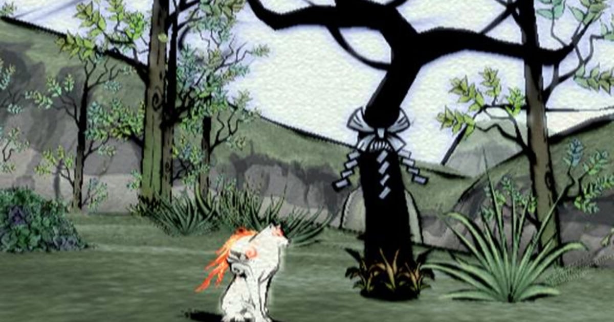
Well, artistically, ER and in general FS games are in a league of their own, put that in a game and many of us will prefer those graphics than Horizon FW ones... That's why less technically complex games look way more impressive to many than TLOU or HFW

I see. So this thread should have ended with no further replies in 2006?

060921_okami_hmed7p.jpg
 
Last edited:

Nydius

Member
Dude I took my flying mount literally up into the clouds and it was lightning inside the cloud.
This isn't directed at you specifically so don't take it personally, it's just a general rant:

I'm tired of hearing about the clouds. The game isn't played in the fucking clouds. There is exactly one quest that even dares to take you high into the clouds and that's the Aerial Capture where you have to chase down the Stormbird. I don't care how gorgeous the clouds look when there's no reason to ever be up there. Almost all of the game takes place on the ground, with a very small portion of it being underwater.

Amazing clouds doesn't change the fact that the DLC introduced new problems with texture and shadow pop-in, more frequent texture glitches, and some lighting oddities where 99% of the game is played. The game is very much a looker, but clouds don't really factor into it for me. Give me these clouds in something like Flight Simulator where the clouds are a core element of the game and I'd be more impressed.

A9lZ65q.jpg
3euEeZx.jpg

Tt4ZXAE.jpg

WzLR2zT.jpg
 
Last edited:
Top Bottom