• Hey, guest user. Hope you're enjoying NeoGAF! Have you considered registering for an account? Come join us and add your take to the daily discourse.

Is Horizon Forbidden West: Burning Shores the Best Looking Game Ever?

Is Horizon Forbidden West: Burning Shores the Best Looking Game Ever?

  • Yes

    Votes: 125 33.0%
  • No

    Votes: 108 28.5%
  • Maybe

    Votes: 47 12.4%
  • Red Dead Redemption 2 is Still King

    Votes: 36 9.5%
  • Cyberpunk 2077 Overdrive Mode FTW

    Votes: 60 15.8%
  • Other (Specify in the Comments)

    Votes: 3 0.8%

  • Total voters
    379

Kataploom

Gold Member
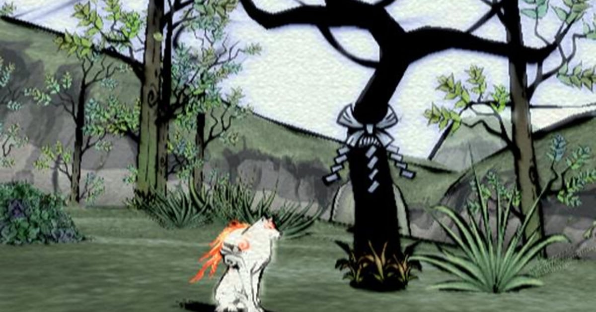
I see. So this thread should have ended with no further replies in 2006?

060921_okami_hmed7p.jpg
Well, the problem is that "graphics"is talked as a general thing without differentiating technical to artistic POV... Imo Code Vein looks great and I'd prefer it graphically to anything Sony western studios have ever done, but many would laugh at the mere mention lol. Also, seems like Horizon it's specially divisive in their art direction
 

I_D

Member
I voted "maybe."
I'm not saying it doesn't look good. It certainly does. I've seen this game in motion on a good tv, and it looks WAY better than those screenshots in the OP.
But damn, the most-popular hosting sites don't do games any favors when it comes to screenshots.

IMGUR and PushSquare, or whatever else compression-heavy sites people tend to use just straight up destroy images.

Combine uber-bad compression with amateur-level photography, and you have down-right bad-looking images.
The screens in the OP don't impress at all. They're blurry as hell, the aliasing is completely unacceptable for showing off the game, the LOD is terrible, and so forth.


For comparison, this is the first game on PC:
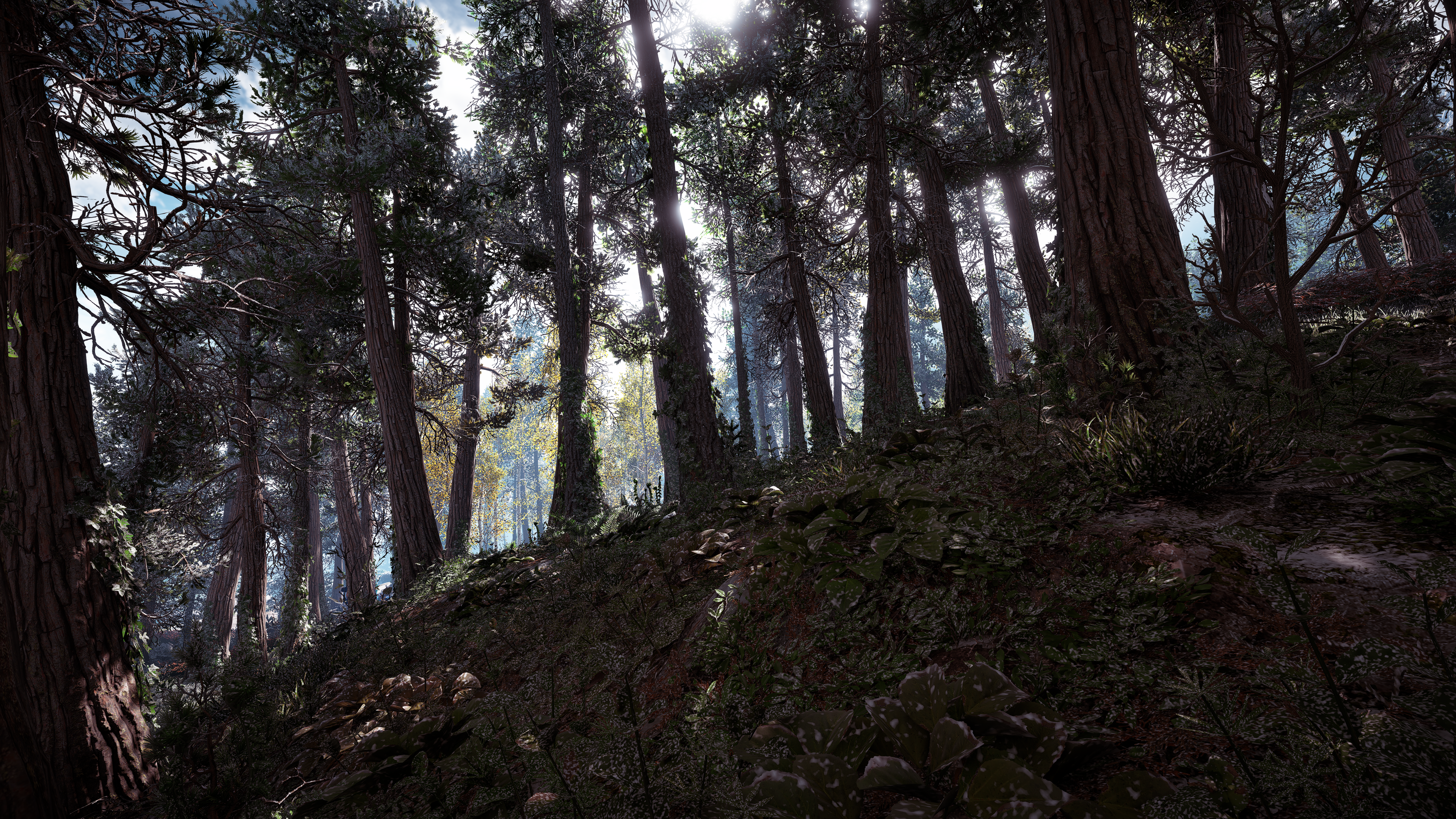
horizonzerodawn15t7ip4.png

horizonzerodawn35y9dsd.png

horizonzerodawn53k8f3q.png


To be honest, the screenshots in the OP are not that big of a difference from the original.
They're certainly better, to be sure, but it's not some sort of ground-breaking achievement.
We're really just barely getting started, when it comes to next-gen games. In a few years, we'll all look back at Horizon and laugh at how primitive it looks; just like we do with every generation.
 

Hunnybun

Member
This isn't directed at you specifically so don't take it personally, it's just a general rant:

I'm tired of hearing about the clouds. The game isn't played in the fucking clouds. There is exactly one quest that even dares to take you high into the clouds and that's the Aerial Capture where you have to chase down the Stormbird. I don't care how gorgeous the clouds look when there's no reason to ever be up there. Almost all of the game takes place on the ground, with a very small portion of it being underwater.

Amazing clouds doesn't change the fact that the DLC introduced new problems with texture and shadow pop-in, more frequent texture glitches, and some lighting oddities where 99% of the game is played. The game is very much a looker, but clouds don't really factor into it for me. Give me these clouds in something like Flight Simulator where the clouds are a core element of the game and I'd be more impressed.
A9lZ65q.jpg
3euEeZx.jpg

Tt4ZXAE.jpg

WzLR2zT.jpg

Yeah I agree. The game looks fantastic but the focus on the clouds is ridiculous - almost a complete irrelevance in terms of actual gameplay.

I've actually played the game for a few hours now and on reflection I still think Ratchet is better looking. It's close but HFW still has some blemishes that I just don't really see in Ratchet: there's still quite a bit of fog and pop in, and the early morning lighting model is kind of ugly. It's close but just not quite there imo.
 

Braag

Member
Considering how Playstation centric GAF is I'm surprised the "yes" option has only 33% votes.
I mean a lot of people just blindly vote their platform of choice usually in such polls.
Ultimately visuals come down to opinions but technical fidelity is harder to argue against.
 

Hobbygaming

has been asked to post in 'Grounded' mode.
Fuuuuuuuuuuuuck yeah it does. No amount high tech can touch great art direction.
I didn't beat Elden Ring but ironically Limgrave was the best looking area I saw in my 30 - 40 hours I only beat around 6 or 7 bosses and dropped it

With that said, from what I saw...

Horizon Forbidden West/Burning Shores looks much better
 

KungFucius

King Snowflake
I'm voting no because the fucking game crashed on me. The base game crashed a few times too. This game is really the only console game where I have experienced multiple crashes even after many updates. I can't recall if it was before or after the crash, but both happened in the Dino theme park. I was killing some douchebags and after the fight, Alloy's friend was walking on air, about 12 feet off the ground.

But the graphics are not that great. Game looks good in cut scenes and on the ground, but flying is all popins and glitches.

I have not tried the new CP mode, but will when the DLC releases.
 
Last edited:

Hobbygaming

has been asked to post in 'Grounded' mode.
Well, artistically, ER and in general FS games are in a league of their own, put that in a game and many of us will prefer those graphics than Horizon FW ones... Actually Horizon artistically doesn't evoke a single thing from me, literally like... It makes me feel nothing, like an AI generated illustration or some"wanting to sound cool" Marvel style joke trying to hard to be fun, may feel like I'm exaggerating but just trying to put examples others can understand. That's why less technically complex games look way more impressive to many than TLOU or HFW
I can see why someone would have that opinion with Elden Ring being more fantasy driven artistically but I'd take the environments in HFW/Burning Shores anyday with its lush moss, dense clouds, gorgeous oceans, molten lava lands

I'd give From the better character design though

Just a difference in preference 👍
 
Last edited:
Considering how Playstation centric GAF is I'm surprised the "yes" option has only 33% votes.
I mean a lot of people just blindly vote their platform of choice usually in such polls.
Ultimately visuals come down to opinions but technical fidelity is harder to argue against.

It's a gamer forum not a playstation forum. So you really shouldn't be surprised.
 
Last edited:

poodaddy

Gold Member
Those NPC's tho compared to Horizon 🤢🤢🤢🤮🤮🤮
Horizon's NPC's are some of the best of all time, such is why when someone proclaims the game's superiority in the realm of graphics they pretty much exclusively focus on close up photo mode shots of character models. Lighting is predominantly what makes a game impressive looking though, and in that arena I find Horizon to be a bit flat looking. Also, as a personal aside, I just don't like the art style of the game at all; it simply isn't interesting looking to me. It's certainly visually impressive, but it's almost sterile in my opinion, there's no mood to it.
 
Last edited:

Ansphn

Member
This isn't directed at you specifically so don't take it personally, it's just a general rant:

I'm tired of hearing about the clouds. The game isn't played in the fucking clouds. There is exactly one quest that even dares to take you high into the clouds and that's the Aerial Capture where you have to chase down the Stormbird. I don't care how gorgeous the clouds look when there's no reason to ever be up there. Almost all of the game takes place on the ground, with a very small portion of it being underwater.

Amazing clouds doesn't change the fact that the DLC introduced new problems with texture and shadow pop-in, more frequent texture glitches, and some lighting oddities where 99% of the game is played. The game is very much a looker, but clouds don't really factor into it for me. Give me these clouds in something like Flight Simulator where the clouds are a core element of the game and I'd be more impressed.
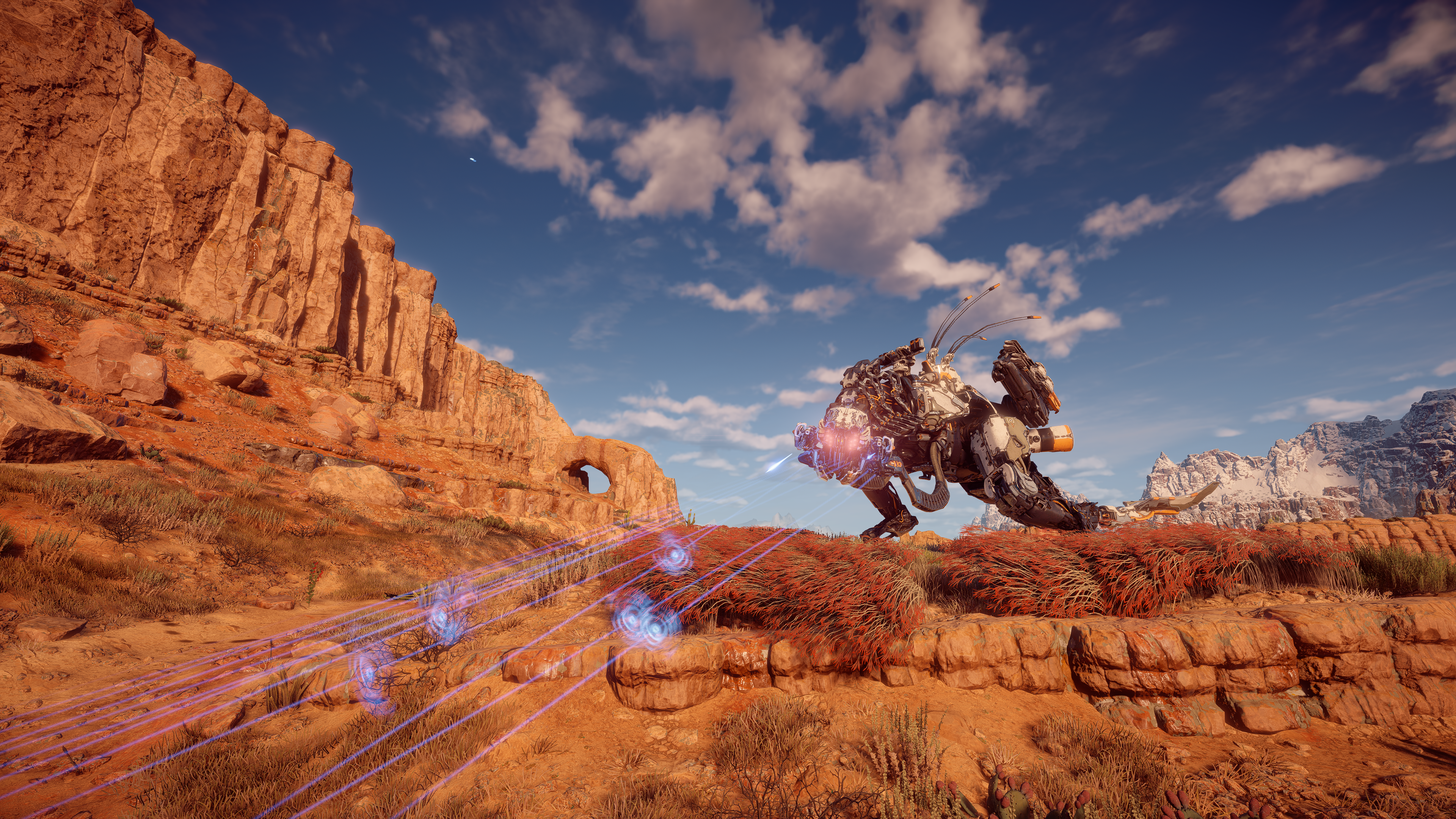
A9lZ65q.jpg
3euEeZx.jpg

Tt4ZXAE.jpg

WzLR2zT.jpg
Not taking it personally. When I mentioned the cloud, it's just one positive on a list of many positives but why do people want to focus on nitpick negatives. Why do people expect this game to be perfect in every way? Do you apply this same criticism to every game that you play. I just don't understand why people want to harp on the negatives and ask for perfection. I was just pointing out the great cloud tech that was added to the DLC because it wasn't in the main game. Also, find me the game that allows you to get up into the clouds and then allow you to traverse the seas with your mount/vehicle with this level of graphics.
 

Skifi28

Member
I'm not fit to judge if it's the best ever as i haven't played every game out there, but it is jaw-dropping in its 40fps mode for sure. I would imagine it's the most impressive modern visual showcase without RT.
 

killatopak

Gold Member
I didn't beat Elden Ring but ironically Limgrave was the best looking area I saw in my 30 - 40 hours I only beat around 6 or 7 bosses and dropped it

With that said, from what I saw...

Horizon Forbidden West/Burning Shores looks much better
You should see Leyndell. Absolutely gorgeous art direction.

I haven’t played HFW so I am inclined to agree with you based on what others are saying about it especially on the technical side. Ultimately though, imo, Elden Ring is the best looking game for me right now. Technical issues not withstanding.
 

Fbh

Member
I don't know how anyone could legitimately believe that's the best looking game of all time. It's nice looking man, but to compare it to Cyberpunk with path tracing is just....I mean it's just silly man.

Not really IMO
I mean Cyberpunk obviously has the superior tech but aside from the lighting system I don't think it's an easy victory over Horizon.
Horizon has some insane level of detail, even the random small animals are really detailed:
cRtGCe7.jpg


Not to mention overall better animations and the character models in general look like a gen ahead of Cyberpunk


Considering how Playstation centric GAF is I'm surprised the "yes" option has only 33% votes.
I mean a lot of people just blindly vote their platform of choice usually in such polls.
Ultimately visuals come down to opinions but technical fidelity is harder to argue against.

I see this "Playstation centric" comment about GAF often but with nothing to back it up.
This place is so Playstation obsessed we voted Xenoblade 3 and Vampire Survivor higher than Horizon Forbidden West during the latest goty awards
 
Last edited:
Yeah I agree. The game looks fantastic but the focus on the clouds is ridiculous - almost a complete irrelevance in terms of actual gameplay.

I've actually played the game for a few hours now and on reflection I still think Ratchet is better looking. It's close but HFW still has some blemishes that I just don't really see in Ratchet: there's still quite a bit of fog and pop in, and the early morning lighting model is kind of ugly. It's close but just not quite there imo.
I agree to be honest - the whole image and everything in it in ratchet is basically flawless - where as I feel with horizon some parts look crazy good but then there’s some stuff thats and weirdly low quality mixed in that makes it feel kinda off comparatively
 
Last edited:
You should see Leyndell. Absolutely gorgeous art direction.

I haven’t played HFW so I am inclined to agree with you based on what others are saying about it especially on the technical side. Ultimately though, imo, Elden Ring is the best looking game for me right now. Technical issues not withstanding.
I also prefer Elden ring to almost any game visually. Technically it’s like a gen behind - but I’ve never seen that level of art in a video game
 

Danjin44

The nicest person on this forum
I also prefer Elden ring to almost any game visually. Technically it’s like a gen behind - but I’ve never seen that level of art in a video game
The way I see it if I don’t like overall visual design of the game then no amount tech gonna be make the game look good to me. This is why I much attracted to art direction game over tech behind graphics.
 
The way I see it if I don’t like overall visual design of the game then no amount tech gonna be make the game look good to me. This is why I much attracted to art direction game over tech behind graphics.
Oh I agree, I’m just saying I get it on a technical level. But games look generally so good nowadays anyway that it doesn’t bother me if a company focuses on art over technical bells and whistles - which from does and it pays off. I was like jaw dropped half of playing that game due to the art
 

Snake29

Banned
I don't know how anyone could legitimately believe that's the best looking game of all time. It's nice looking man, but to compare it to Cyberpunk with path tracing is just....I mean it's just silly man.

Cyberpunk's level of detail isn't really great at all. All that bloom, lighting and RT is pretty much covers the bad textures.


I mean look it doesn't look good at all. Id even dare to say that GTA5's world looks much much better and the level of detail alone is more impressive. Cyberpunk mostly has to rely on its lighting and RT, but apart from that everything looks low res and flat.

I'm not impressed by the world texturing you see in my timed stamp.
 
Last edited:

Nydius

Member
When I mentioned the cloud, it's just one positive on a list of many positives but why do people want to focus on nitpick negatives.
I hardly think the insane amount of texture and shadow pop in the DLC introduced is "nitpicking". It's bad. Egregiously so and on all three graphics settings. It wasn't an issue in the base game (nor did the base game have issues loading the stash or gear inventory), so it's entirely new to this DLC/upgrade patch. If it had been like this in the base game, it would have been (rightfully) called out for it.

Also, find me the game that allows you to get up into the clouds and then allow you to traverse the seas with your mount/vehicle with this level of graphics.
I suppose where we diverge is in the point of form over function. Yeah, the clouds and the seas are beautiful. But what good is that beauty when it's functionally useless space? The map is too small to ever fly at max ceiling for any reason and there's only one sky based side mission. As I mentioned in the OT, there's no need or use for the Waterwing other than the single main story mission to get to Jurassic Pangea Park. It doesn't open up underwater areas you couldn't explore without it -- it just becomes a slightly faster pelican Sunwing with a water gimmick that has no meaningful use.

It would be like getting a brand new Ferrari without an engine or transmission and having it sit in your garage. Sure, it's still a beautiful car but it's just a useless frame. If they had given us stuff to do in the skies and the seas, I'd be more inclined to praise them for the graphical beauty of them. As it stands, it's just marketing that has little to no bearing on the total game.
 
Last edited:

poodaddy

Gold Member
Not really IMO
I mean Cyberpunk obviously has the superior tech but aside from the lighting system I don't think it's an easy victory over Horizon.
Horizon has some insane level of detail, even the random small animals are really detailed:
cRtGCe7.jpg


Not to mention overall better animations and the character models in general look like a gen ahead of Cyberpunk
I qualified my opinion earlier in the thread. The models are better beyond the shadow of a doubt. The lighting, absolutely not in any way. The textures, in spots yes but not generally. The animations, yes. The art style? That's relative, but I find Horizon boring to look at. Not big on the type of locales featured in the game, but it's impressive work to be sure.
 

Hunnybun

Member
I agree to be honest - the whole image and everything in it in ratchet is basically flawless - where as I feel with horizon some parts look crazy good but then there’s some stuff thats and weirdly low quality mixed in that makes it feel kinda off comparatively

Yeah whether or not one is better looking than the other is kind of debatable, but what's not is that Ratchet is ridiculously underrated. It's absolutely beautiful and to think it's doing all that with the burden of RT at 60fps for me still puts it in a class apart, technically.
 

Gambit2483

Member
Decima is hands down the best engine
Decima is indeed impressive...but until they show off more of what the engine can do it's not better, imo. Not when HFW clearly has better Sky and Underwater tech. Also their engine can render better NPC characters. Maybe Death Stranding 2 will prove me wrong...
 
Considering how Playstation centric GAF is I'm surprised the "yes" option has only 33% votes.
I mean a lot of people just blindly vote their platform of choice usually in such polls.
Ultimately visuals come down to opinions but technical fidelity is harder to argue against.
You're surprised that an exclusive game (even if it's a Playstation one) is winning by little when it has a woman, a lesbian one at that as a main character?
Considering how much people mock this game and its main character in here for not looking like a barbie or an anime sexy underaged school girl i actually expected the "yes" to be losing, not winning.
 
Decima is indeed impressive...but until they show off more of what the engine can do it's not better, imo. Not when HFW clearly has better Sky and Underwater tech. Also their engine can render better NPC characters. Maybe Death Stranding 2 will prove me wrong...
I mean, decima was used for Killzone and Until Dawn as well.

the fact that was used by KojiPro (and even patented the weird shit they do when the boss fights happen) working in the engine's source code at the same time (between them and guerrilla). could mean Decima is a very flexible/"easier" engine to use.
 

Kvally

Member
Cyberpunk's level of detail isn't really great at all. All that bloom, lighting and RT is pretty much covers the bad textures.


I mean look it doesn't look good at all. Id even dare to say that GTA5's world looks much much better and the level of detail alone is more impressive. Cyberpunk mostly has to rely on its lighting and RT, but apart from that everything looks low res and flat.

I'm not impressed by the world texturing you see in my timed stamp.

I have never seen Cyberpunk. Holy shit that looks awesome.
 

CGNoire

Member
For Character Rendering most likely but for Enviroment Rendering....Im not so sure. That probably gos to CP ODM.

Enviroments take up way more screen realestate and matter more to the overall look of moment to moment gameplay.
 
Last edited:

Gambit2483

Member
I mean, decima was used for Killzone and Until Dawn as well.

the fact that was used by KojiPro (and even patented the weird shit they do when the boss fights happen) working in the engine's source code at the same time (between them and guerrilla). could mean Decima is a very flexible/"easier" engine to use.
It could, yes...like I said, Here's hoping Death Stranding 2 proves me wrong.
 

analog_future

Resident Crybaby
It's impressive on a technical level, but I don't jive with it artistically. It's the "throw everything and the kitchen sink" technique.

The whole game is the 2023 version of this:

64pZy.jpg
 
Last edited:

CGNoire

Member
KAwAbS9.gif


It is significantly improved from the first game. In the first game you couldn't even swim underwater. Seriously everything dealing with the water and sky has been vastly improved from the original.

Also, the character models and animations for the NPCs are on a completely new level. Do yourself a favor and look up some comparison videos on YouTube (though not the true ideal way) to see the differences between both games
I think he met HFW not HZD.
 
Yeah whether or not one is better looking than the other is kind of debatable, but what's not is that Ratchet is ridiculously underrated. It's absolutely beautiful and to think it's doing all that with the burden of RT at 60fps for me still puts it in a class apart, technically.

Ratchet is more of a true next-gen game than Forbidden West. I think people downplay it due to the cartoon art style. There are several areas in Ratchet that are on another level. Ratchet throws more things on screen at a higher fidelity than I've seen any game do ...possibly including the PC. While I would rank Cyberpunk higher due to its incredibly dynamic RT lighting, look at all the npc's rendered in Ratchet with super detailed models with wonderfully complex animation and routines. Even during ganeplay with all the rediculous particle effects flying everywhere. I'm thinking of the intro level, the Nefarious City level, the mining planet area- Ratchet is really utilizing the ps5 in ways I havnt seen other games and as a result feels more dynamic. Even has some de ent quality RT reflections which aid in the dynamic nature of the game.
 
You're surprised that an exclusive game (even if it's a Playstation one) is winning by little when it has a woman, a lesbian one at that as a main character?
Considering how much people mock this game and its main character in here for not looking like a barbie or an anime sexy underaged school girl i actually expected the "yes" to be losing, not winning.

almost as if this is a discussion about graphics and not gender politics?
 

Woggleman

Member
To me TLOU2 is my favorite looking game. They made a normal American city like Seattle look like some war torn remote jungle. The art direction is just insane.
 
I have never seen Cyberpunk. Holy shit that looks awesome.

I qualified my opinion earlier in the thread. The models are better beyond the shadow of a doubt. The lighting, absolutely not in any way. The textures, in spots yes but not generally. The animations, yes. The art style? That's relative, but I find Horizon boring to look at. Not big on the type of locales featured in the game, but it's impressive work to be sure.

The textures worse in Horizon? They look better in screen shots but I'm genuinely curious for those on PC- are the textures in general higher res than Horizon? Probably are right?

If so what is it that makes people think FW's textures/models are "better"? Could it be the shaders or just art direction?
 
Top Bottom