• Hey, guest user. Hope you're enjoying NeoGAF! Have you considered registering for an account? Come join us and add your take to the daily discourse.

Indie Game Development Discussion Thread | Of Being Professionally Poor

Status
Not open for further replies.

cbox

Member
Cools. So you guys decided to go partnership over corporation? Did you guys get an accountant, and lawyer up? Or just doing it all yourself?

I'm thinking I should register a business soon as well, and it's all so confusing. In BC, Canada, btw. =)

Ya partnership for now and then we'll see what the future holds. We're going to try this solo for now and then reach out to the proper channels when we feel we need em :D

Canada REPRESENT!

Also.

Indie Game Dev Thread |OT2| GAF, plz greenlight

EDIT HOLY CRAP, after just about 3 years on greenlight..

nev7oPp.png
 

F-Pina

Member
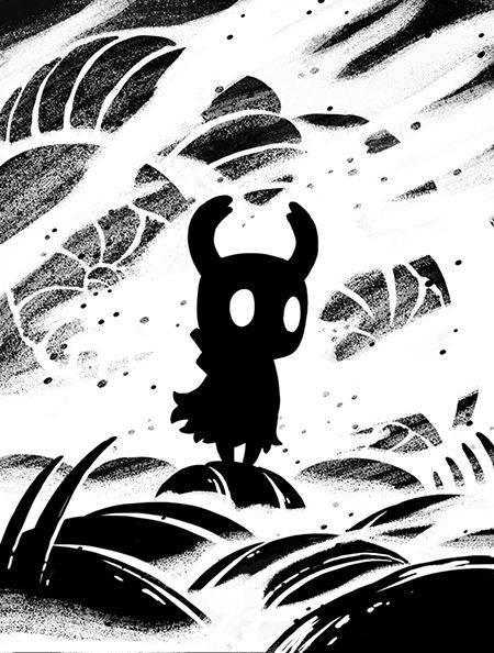
Yo Indie GAF! Hollow Knight is now over its Kickstarter funding goal and heading through its stretch goals with 58 hours left on the campaign!

Just wanted to say a huge thank you to everyone in this thread who's supported the game, and I'm mega-excited to be able to make it!

No game pics today (more tomorrow!), but here's a design from one of the screen prints that a bunch of backers will receive:

print_example_smaller_zpsf4cb92b6.jpg

Again, congrats man!
 
Now I feel offtopic

https://www.youtube.com/watch?v=ox3j9A2HXWQ

Some friend of mine recorded some excerpts from the demo I showcased at RetroSevilla (a local expo at my hometown) and made this Early-Preview-Trailer.

It's short, it's blurry, it has no combat, there are errors in the backgrounds, and I didn't finish the character remake I started last month (so you'll notice some inconsistencies in the animations), but you might still want to check it out if you're curious about how the game will look like.

I know, pic or you won't click.-


Apart from the footsteps sound everything looks great.
And yay! More spanish dev's in the neogaf indie thread!

Yo Indie GAF! Hollow Knight is now over its Kickstarter funding goal and heading through its stretch goals with 58 hours left on the campaign!

Just wanted to say a huge thank you to everyone in this thread who's supported the game, and I'm mega-excited to be able to make it!

No game pics today (more tomorrow!), but here's a design from one of the screen prints that a bunch of backers will receive:

print_example_smaller_zpsf4cb92b6.jpg

Congrats! :D
 
Looks like an xkcd porn orgy. :p

Hahaha yeah.

Oh, I was actually referring to my veritable landmass of unshipped, unfinished games. Shipping when I'm finished means I'll never ship anything! :p

Oh oops :)

Indie Game Dev Thread |OT2| GAF, plz greenlight

EDIT HOLY CRAP, after just about 3 years on greenlight..

nev7oPp.png

CONGRATS!!!!!!!!!!!!!!!!!!!


Also I just discovered this VizionEck SQS game pop up on Windows phone lol: http://allaboutwindowsphone.com/software/content/VizionEck-SQS-Edition.php
 

2+2=5

The Amiga Brotherhood
"Yes" :-D
I can relate: when I got the lifebars working, it immediatly felt more "gamey" :-D

The main remark I'd have right now is to lower the horizon line in the background a bit - I can understand the legibility concerns, but it feels a bit weird to me to have the trees so far up in the frame, as if the camera was pointing way down, and yet seeing the characters straight from the side. If the contrast is too strong, maybe tint the BG a bit to detach it from the saturated foreground characters?

As for the body indicator, (if I understand correctly, it's for a system to show damage to different body parts): some games I remember that use indicators like that are Deus Ex and Super Robot Taisen GC (EDIT: Mixed up all my references! I was thinking of another Xbox game, Tao Feng, but it doesn't actually have a body indicator, "only" limb damage), might want to look at those to see how they presented it if you haven't already? What I'd suggest is to separate the different limbs that need to be identified as individual (say, if you detect arm damage differently from body damage, then the arms shouldn't be attached to the body). In the same vein, if legs are individualized, I'd spread them a bit so it's a bit clearer which one is which in the heat of action. Maybe put the indicator itself on a sort of panel, similar to how both bars are, with a clear outline and back, so that it pops out better from the background as well?

Good luck with the characters in the background, it takes a while but it's quite fun to do! If you wish to add chars from games shown here (I heard it was a thing recently), feel free to get Honey in there :-D

Thanks for the precious suggestions! :D

You are right about the horizon, for some reason i had no problem with it lol, well at least i can easily lower it.

About the damage indicator it only has 3 parts: head, bust/arms and legs, that's why arms are connected to the bust and legs are together. I really like the ones you suggested, my idea was to make the indicator big, simple and as "abstract" as possible to be easily readable, somehow similar to traffic lights, but i'm still not satisfied. I tried it into a panel with a different hud, i should try again.

Thanks for granting me the permission of putting Honey in it! :O I'll do my best to make her look as good as in your game! XD
 
Ya partnership for now and then we'll see what the future holds. We're going to try this solo for now and then reach out to the proper channels when we feel we need em :D

Canada REPRESENT!

Also.

Indie Game Dev Thread |OT2| GAF, plz greenlight

EDIT HOLY CRAP, after just about 3 years on greenlight..

nev7oPp.png
BOOOOOOOOOOOOOOOOOM! GRATS!
 

Pehesse

Member
Thanks for the precious suggestions! :D

You are right about the horizon, for some reason i had no problem with it lol, well at least i can easily lower it.

About the damage indicator it only has 3 parts: head, bust/arms and legs, that's why arms are connected to the bust and legs are together. I really like the ones you suggested, my idea was to make the indicator big, simple and as "abstract" as possible to be easily readable, somehow similar to traffic lights, but i'm still not satisfied. I tried it into a panel with a different hud, i should try again.

Thanks for granting me the permission of putting Honey in it! :O I'll do my best to make her look as good as in your game! XD

No problem :-D

I understand the damage indicator better now - and I actually remembered another one, a lot closer actually, Soul Calibur Broken Destiny on PSP, which had a 3 point system as well (head/torso/legs, I believe it was). They used a simple vertical bar to show which part was damaged though, no humanoid shaped indicator... but maybe it's better, legibility-wise? I don't know, food for thought :-D Mind you, I like the idea of the traffic light style indicator!. Since the arms are a part of the "body zone", maybe put them closer to the body to have more of a single mass?

Ya partnership for now and then we'll see what the future holds. We're going to try this solo for now and then reach out to the proper channels when we feel we need em :D

Canada REPRESENT!

Also.

Indie Game Dev Thread |OT2| GAF, plz greenlight

EDIT HOLY CRAP, after just about 3 years on greenlight..

nev7oPp.png

\o/
Congrats :-D
 
Ya partnership for now and then we'll see what the future holds. We're going to try this solo for now and then reach out to the proper channels when we feel we need em :D

Canada REPRESENT!

Also.

Indie Game Dev Thread |OT2| GAF, plz greenlight

EDIT HOLY CRAP, after just about 3 years on greenlight..

nev7oPp.png

This is too cool, congratulations! :)
 

MurderOfPoes

Neo Member
Now I feel offtopic

https://www.youtube.com/watch?v=ox3j9A2HXWQ

Some friend of mine recorded some excerpts from the demo I showcased at RetroSevilla (a local expo at my hometown) and made this Early-Preview-Trailer.

It's short, it's blurry, it has no combat, there are errors in the backgrounds, and I didn't finish the character remake I started last month (so you'll notice some inconsistencies in the animations), but you might still want to check it out if you're curious about how the game will look like.

Looks pretty great.
Is the blur from the game? It really seems it's from the video having been rendered without disabling interpolation.
 

AriEX2

Member
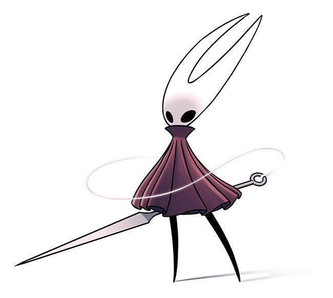
Hollow Knight's cruising towards the end of its Kickstarter! Not long to go and we've already hit that Wii U stretch goal!

Next goal is 2nd playable character Hornet. I'm really hoping we can hit it. She wields a needle and thread so animating her attacks would be a tonne of fun!

986ae3adee4a1ee31067b2aae96d74d7_large_zpscf38200e.jpg


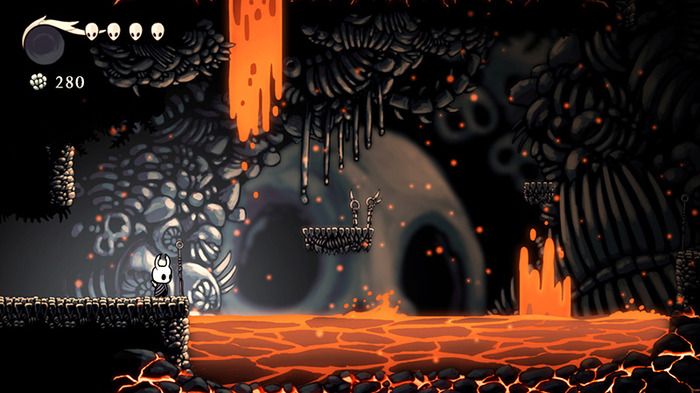
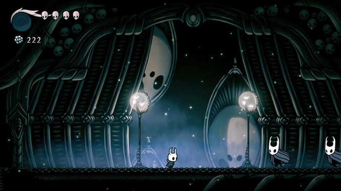
Also some new screens from the latest KS update:

ed0b86fc6adb1fafa9562f31b26a7131_large_zpse0812169.jpg


ce0fac13537008c503eb853b86f73367_large_zps819cecca.jpg
 

Ito

Member
looks nice! nice sound effects, the environment art of the first area is really killer.

when are you going to show combat?

Thank you. I wanted to show some combat gameplay too, but It doesn't feel polished yet. Hibari needs a couple more transition animations, and I have yet to set how the enemies will react to your hits.

I want it to be "spectacular" so it will take some time. That's whay I'll probably save that for a future trailer. I'd say January if everything goes ok (it won't).


I'm with Jobbs on this. Gimme some of that sweet sweet combat!

:( read my reply to Jobbs

Awesome looking! We knew the animations and environments (especially the urban one, wow) were already good looking, but those sound effects are on point as well. Did you make them yourself? If not, found them someplace accessible? (not that I'd look at the same place, I'm just asking because, umm...)

As a side note, I'm a bit less of a fan of the third environment, because of the very saturated pink background and the heavy sounds when landing on apparently cloudy platforms, but I'm not sure if it's a placeholder environment, or a dreamy/cloudy landscape that would make more sense in context?

And I'll add my voice to the pile: we want to see combat now :-D


Thank you :) The sound effects, some I recorded myself, most of them I grabbed from freesounds.org (it has a huge database). All of them were edited and mixed with my own sound effects so I'd say they feel pretty "unique" and different from the source.

Hibari's voice was recorded by her voice actress (@sydsnap on twitter).

About he last section of the video: in my game, some of the hidden optional power-ups will require you to complete this kind of short platforming challenge. I think it makes it more rewarding. The level shown in the video is the first and easiest challenge (it makes use only of the most basic game mechanics).

Both art and sound in the footage were placeholders. These challenges take place in the spirit world, an important place you'll have to visit a couple of times in the game and that doesn't have propper artwork yet.

All I know is it will look otherwordly, colorful, and heavenly. Thats why I used pink and clouds as placeholder elements.

Apart from the footsteps sound everything looks great.
And yay! More spanish dev's in the neogaf indie thread!
Congrats! :D

Thanks :D I messed up with the footsteps samples volume. Also, some of them (cloud section) were placeholders. It's my first time dealing with 3D sound so I have to work on that.

Where are you from exactly?

Looks pretty great.
Is the blur from the game? It really seems it's from the video having been rendered without disabling interpolation.

Thank you too! The blur was caused by the recording or the compression. The game looks sharp and doesn't have motion blur.

Can't say much about the recording settings since I didn't record it myself.


First of all, congrats for the successfull KS! I'm glad that KS corpse it's still warm and that good projects like yours or Crossing Souls could reach their funding goals!

Second, I effing love lava levels. But dam the spooky faces in the background :(
 

Kyuur

Member
I'm thinking of backing for the Wii U ver of Hollow Knight, does anyone know what engine the game will be running on?

It's running on Stencyl, but I'm going to guess they will be moving forward with porting it to Unity if Wii U is in the mix. These kind of questions should probably go in the kickstarter thread for it btw, not the indie dev thread. :)
 

Sify64

Member
It's running on Stencyl, but I'm going to guess they will be moving forward with porting it to Unity if Wii U is in the mix. These kind of questions should probably go in the kickstarter thread for it btw, not the indie dev thread. :)
Thanks for the info. And you're right, I actually meant to ask the question on the kickstarter thread at first.
 

Bollocks

Member
Is there a site that primarily interviews developers?
Not necessarily about the game but more about the technical challenges, why you do it, how you manage it, side effects, negative things.

I would love to see a site like this
 

AriEX2

Member
Thanks for the info. And you're right, I actually meant to ask the question on the kickstarter thread at first.

That's cool Sify64. Kyuur is pretty dead on here anyway! The current build is in Stencyl, but we'll be looking to port to Unity for Wii U release (and hopefully other systems later down the line!).

It also means we can incorporate lots of nifty graphical effects that we can't quite achieve in Stencyl, so expect things to look a whole lot better!
 

Sify64

Member
That's cool Sify64. Kyuur is pretty dead on here anyway! The current build is in Stencyl, but we'll be looking to port to Unity for Wii U release (and hopefully other systems later down the line!).

It also means we can incorporate lots of nifty graphical effects that we can't quite achieve in Stencyl, so expect things to look a whole lot better!
Great to hear that Unity is in the plans. Got a bit worried after hearing about the porting difficulties facing another Kickstarter I backed.
 

oxrock

Gravity is a myth, the Earth SUCKS!
Has anyone tried out the new Godot engine? I've only seen a youtube vid of it so far, no hands on but it seems pretty cool. Wondering if anyone has some experience with it and can offer their opinions.
 

AriEX2

Member
Yo, cheers indie GAF! Hollow Knight is funded and then some. We've got Wii U, a whole bunch of additional quests and areas and a second playable character, Hornet!

4f577748f31c1ad5d6b99df1230fc832_large_zps5f4fd4ad.jpg


So much stuff to do, but pumped to get into it. Thanks for supporting the game all the way along. I'll keep sharing stuff!
 

Xtra Mile

Neo Member
Yo, cheers indie GAF! Hollow Knight is funded and then some. We've got Wii U, a whole bunch of additional quests and areas and a second playable character, Hornet!

4f577748f31c1ad5d6b99df1230fc832_large_zps5f4fd4ad.jpg


So much stuff to do, but pumped to get into it. Thanks for supporting the game all the way along. I'll keep sharing stuff!

Congrats! Looking forward to the release.

I'll be attempting KS in a few month myself. Still much to do.
 

bkw

Member
For menu navigation, do you guys prefer having only one controller be in control? Or allow anyone/everyone be able to do stuff? (Or maybe it really doesn't matter and I'm over thinking this...)
 

Sithus

Neo Member
Hi Guys thanks for this helpful thread.

I always wanted to make a game but never started... so i want to create a short business simulation game. Without the fancy graphics. Something like this

Which developer tool should I use to achieve a fast result?

thanks for the help
 

2+2=5

The Amiga Brotherhood
No problem :-D

I understand the damage indicator better now - and I actually remembered another one, a lot closer actually, Soul Calibur Broken Destiny on PSP, which had a 3 point system as well (head/torso/legs, I believe it was). They used a simple vertical bar to show which part was damaged though, no humanoid shaped indicator... but maybe it's better, legibility-wise? I don't know, food for thought :-D Mind you, I like the idea of the traffic light style indicator!. Since the arms are a part of the "body zone", maybe put them closer to the body to have more of a single mass?

I like the idea of the three bars they would be more in line with the other bars, but i would like some sort of icon near them to explain what each bar is associated to so i would still need some sort of man lol.
After thinking a little i understood why i was not convinced by the man, i didn't like the arms and legs position and the fact that it doesn't look to belong to the same hud of the bars because it seems to have a different style.
I redraw it with open legs and and closer arms and it's a little better so for now i'll stick with it, but i still want to find a way to make it look more in line with bars.
In the mean time i also lowered the horizon and added a pair of clouds(well my first attempt to them at least) and another guy on the right.

I'm also doing a Gameboy port
just a shader
 
Ya partnership for now and then we'll see what the future holds. We're going to try this solo for now and then reach out to the proper channels when we feel we need em :D

Canada REPRESENT!

Also.

Indie Game Dev Thread |OT2| GAF, plz greenlight

EDIT HOLY CRAP, after just about 3 years on greenlight..

nev7oPp.png

Congratulations! We just hit the top 100 last night (currently number 82)

How long were you in the Top 100 before you got Greenlit? We're over here hoping desperately that we can somehow get Greenlit and launch during the Holiday sale, but we know it won't happen.
 
Hi Guys thanks for this helpful thread.

I always wanted to make a game but never started... so i want to create a short business simulation game. Without the fancy graphics. Something like this

Which developer tool should I use to achieve a fast result?

thanks for the help

I can't tell what kind of systems the game requires from the description - I'm on droid so I can't download. What are you looking to do in terms of game logic, visual assets, etc?
 
Thanks :D I messed up with the footsteps samples volume. Also, some of them (cloud section) were placeholders. It's my first time dealing with 3D sound so I have to work on that.

Where are you from exactly?

Me and the other artist are from Valencia, the programmer is from Barcelona, but he is now living in the UK.
 

cbox

Member
Congratulations! We just hit the top 100 last night (currently number 82)

How long were you in the Top 100 before you got Greenlit? We're over here hoping desperately that we can somehow get Greenlit and launch during the Holiday sale, but we know it won't happen.

Honestly our stats are so strange, I was thinking of doing a blog post about it, but it'll have to wait for now. We weren't in the top 100
 

oxrock

Gravity is a myth, the Earth SUCKS!
I'd like to read some opinions on this too. I'm surprised it's not getting more attention.

Truthfully I am as well. My primary language is python and from what I can tell, the syntax is amazingly similar. Right now I'm using pygame with the intention of switching to unity once this project is done, but if Godot is a viable option, that may very well change.
 

bumpkin

Member
So to any of the programming minded people, I pose a question...

When you're dealing with a codebase that will be compiled for multiple platforms, which is better?

a. A single header file that has preprocessor macros for which libraries to include

Code:
// Includes.h

#include <iostream>

#ifdef _WIN32
   include <windows.h>
#else
   include <macstuff.h>
#endif

a. Multiple header files and preprocessor macros that determine which to include

Code:
// WindowsIncludes.h

include <windows.h>

Code:
// MacIncludes.h

include <macstuff.h>

Code:
// main.cpp

include <iostream>

#ifdef _WIN32
    include "WindowsIncludes.h"
#else
    include "MacIncludes.h"
#endif
 
For menu navigation, do you guys prefer having only one controller be in control? Or allow anyone/everyone be able to do stuff? (Or maybe it really doesn't matter and I'm over thinking this...)

Depends on the game but usually I think it's best to only have one person in control at a time, but allow other people to take over control from that person by pressing pause or something. That way accidental bumps by other players don't mess up the menu but you're still not forcing people to pass controllers.

Looks like an xkcd porn orgy. :p

Now I can't NOT see that :( hahaha
 

Das-J

Law of the West
Yo, cheers indie GAF! Hollow Knight is funded and then some. We've got Wii U, a whole bunch of additional quests and areas and a second playable character, Hornet!

4f577748f31c1ad5d6b99df1230fc832_large_zps5f4fd4ad.jpg


So much stuff to do, but pumped to get into it. Thanks for supporting the game all the way along. I'll keep sharing stuff!

Congrats brother - Looking forward to the game!
 

Popstar

Member
So to any of the programming minded people, I pose a question...

When you're dealing with a codebase that will be compiled for multiple platforms, which is better?

a. A single header file that has preprocessor macros for which libraries to include

a. Multiple header files and preprocessor macros that determine which to include

Er... neither?

You should be trying to avoid platform-specific includes or macros in your header files. It suggests that your doing a lot of #ifdef <platform> in your implementation files which gets quite unwieldy quickly.

That said... if you gotta do it 'cause you gotta do it... I'd prefer the second way. If you later refactor to isolate your platform code you're already partly done.
 

bumpkin

Member
Er... neither?

You should be trying to avoid platform-specific includes or macros in your header files. It suggests that your doing a lot of #ifdef <platform> in your implementation files which gets quite unwieldy quickly.

That said... if you gotta do it 'cause you gotta do it... I'd prefer the second way. If you later refactor to isolate your platform code you're already partly done.
Thanks for the reply. You said the second way is probably the least bad of the two. What else would be a good way to handle this scenario?

I'm building the main project on a Mac in Xcode and trying to make it so that I can literally import the entire codebase (header and implementation files) into a Visual Studio project and be able to just hit build. What I have works, I'm just curious if there's a better way.
 

Popstar

Member
Usual practice is to isolate your platform specific stuff into separate implementation files.

So you might have a folder in your project called "platforms" with subfolders "windows", "osx", "ps4... In each subfolder you would have platform specific stuff. i.e.: file_win.cpp, file_osx.cpp, file_ps4.cpp...

Each of these files would implement a generic cross-platform API.

This can be a fair bit of work however so you may not want to go that far. Instead just trying to keep dependencies on platform-specific includes as low as possible is a good way to start.

Try commenting out all your platform-specific includes and see how much of your project still compiles. The more the better. This is why its good to keep stuff out of your headers. If a .cpp file never includes (directly or indirectly) a platform-specific header there's a much better chance it will work when moving to a new platform.

Also – because of the above – never use pre-compiled headers. Seriously.
 

GulAtiCa

Member
Starting the fun process of getting my game (Wii U: ZaciSa's Last Stand) rated for PEGI countries tonight. Think I'm going to rename the game too there, something like ZaciSa's Doodle Defense. Make more sense, and might just be better. Esp as it fits the art style (crayons) better.

Will also hire someone to redo the main store graphics too at some point in the next month.
 

Blizzard

Banned
So to any of the programming minded people, I pose a question...

When you're dealing with a codebase that will be compiled for multiple platforms, which is better?

a. A single header file that has preprocessor macros for which libraries to include

b. Multiple header files and preprocessor macros that determine which to include[/code]
I've been watching the Handmade Hero stream and the practice recommended by Casey is, if I remember correctly, what Popstar said where the platform file is completely different and you do not need to include headers. Casey uses a somewhat unusual setup though, where the game itself basically provides "services" in the form of functions the platform code calls. So a render function would get called by the platform code, and maybe an input-handling function would get called, and the game code itself would just need to implement those.

Again if I recall correctly, one of the general principles advocated was this: The less communication between the game code and the platform code, the easier and more reliable a porting effort will be.

I don't know if I will get Mac and Linux support working for my engine, but what I had planned so far was something similar to the second approach -- ideally just having one general header file that includes platform-specific stuff so each build would be properly set up. However, it's not ideal as Popstar (and Casey) might point out, plus in some cases (especially font rendering) it seems difficult for me to fully isolate platform-specific code like that.

HOWEVER 2.0, as discussed earlier I may want to resist the urge to refactor everything or I may have even less chance of ever finishing a project. :p
 
So GunWorld was #68 in the top 100 on Steam Greenlight, but now it's all of a sudden 0% of the way to the top 100. Is Greenlight just wigging out or something?
 

Burt

Member
Haven't really dropped in here in a while because I haven't had anything to show, but that's because I've been working on the under the hood stuff the last couple weeks so that I can eventually just focus on pumping content out.


Good news on that front is that the game is pretty much 100% a game now. Battle system, town-level environments and interactions, cutscene engine, Ogre Battle-style overworld/maps, experience system, class system, all that jazz, it's all in. Really, I just need to put the world map in and I think I can finally start making some serious vertical progress.

Yeah, all the art is placeholder by the way, obviously. If I hadn't had a few tonight I wouldn't be posting this, but I did, and this thread is my only outlet that isn't Twitter, so I'm venting the crappy art here. Speaking of which, if anyone knows of a good, dependable pixel artist and/or animator, I'm looking to hire one. If anyone knows of any UI design guides/tips they could point me in the direction of, that'd be a great help too. That's one of the things I think I could handle quality-wise if I just knew how to make it not-hideous.

Really, though, I just came to say that when you're trying to put in the "blind" status effect, and you forget what status effect you're working on, and then while you're trying to think of that you forget what you're working on altogether, it's time to call it a night and do some "research", in my case, with Tactics Ogre.
 

V_Arnold

Member
Burt, keep it up! I wish I could say the same to my projects as well :D
I am working on it, and it is progressing, but slooowly. My biggest issue is that when I take more than a few days off programming, when I come back to my code, I barely get what I was trying to do :D

A great sign that I need a much better commenting structure in my code :p
 
Steel Assault | NES-styled sci-fi action platformer | Update #2
(12/01/14 - Update #1)

An accurate depiction of university commuters' everyday struggle:


[[click for full Youtube video link]]


To find more, you can follow @SteelAssault on Twitter or check out the game's official website!

whoa, this looks amazing. What platform is this coming out on? I'm getting G.I. Joe NES vibes from it.

Getting really close to wrapping up Shutter. Adding in a sequence at the end where the drone you control gets trapped, and you go back into the house as a human in first person.

Shutter%20-%20Dec20%20-%204_small.png
 
Status
Not open for further replies.
Top Bottom