Fat Frog
I advertised for Google Stadia
To be fair, they said in "most" games.Not to mention that's incorrect. Advance 1 is very much like the Genesis games.
Sonic Advance is far from unpopular or a famous example of bad physics.
To be fair, they said in "most" games.Not to mention that's incorrect. Advance 1 is very much like the Genesis games.
Calling back Naoto Ohshima for a Sonic game(Arzest confirmed) was a step in the right direction.
Good future incoming
Oops, no it's gonna be terrible. This is seriously the worst Sonic level design I have seen.
Pay Yasukara all the money in the world to fix this.
Oops, no it's gonna be terrible. This is seriously the worst Sonic level design I have seen.
Pay Yasukara all the money in the world to fix this.
That music was in sonic 4 episode 2 lol.
Also the level design seems to be on par with that. Just hire someone frlm the community to make some decent maps, because sonic team clearly cant.
I honestly dunno if people were pretending or did not watched the video. Because when I pointed out this video from IGN and even complained about music I was told it was only placeholder. Ok but about the lameass simplistic visuals? What about the level design?
At this point I rather believe that since Frontiers people just lowered their standarts.
I mean it wouldn't be the first time a sonic game has a few recycled tracks, but to me it seems like the usual sonic team game.
Sonic 4 episode 2 wasn't as bad as episode 1, but clearly not on par with the genesis games and this seems it will be the same thing, except for the artstyle.
I hope to be wrong, but the issue is always the same. The lack of agency when it comes to letting the player build up speed. It's always the same thing: boost pad, boost pad, grinding or other gimmicks that get old quickly.
They were real, until they decided to not work with Taxman again. Can’t believe we could’ve had a potential Mania 2/Sonic 5 with them, only for it to fall through. They better not shit the bed here.Yeah, I'm getting New Super Mario Bros. U Deluxe vibes which is a bad thing.
Let us hope the Mania 2 whispers are real
They were real, until they decided to not work with Taxman again. Can’t believe we could’ve had a potential Mania 2/Sonic 5 with them, only for it to fall through. They better not shit the bed here.
The problem here isn't so much that it's linear it's that it's relying super heavily on forks in pipes and other choke points and allowing very little free movement or real platforming.Yeah, the level design is a concern. But I’m hoping that what’s been shown is just one pathway, and that the others are more interesting/challenging. I don’t know, but they better figure that out.
Yeah that's my understanding as well. It was in development at one point and is no longer.They were real, until they decided to not work with Taxman again. Can’t believe we could’ve had a potential Mania 2/Sonic 5 with them, only for it to fall through. They better not shit the bed here.
That's because the designer working on this also worked on Sonic CD. That was a Sonic CD trait, you ever play stardust speedway?I don't mind recycled as well, but good lord those looks like recycled stuff from Generations. I'm more concerning about going on underground tunnels over and over...does people even noticed that? Boost pad spam is a clear a trademark of Sonic Team. They usually do this since they are not confident on how their physics work and needs pads to impulse Sonic to keep his speed momentum.
With Naoto Ohshima, i guess it will be a level design a la Sonic CD (the platformer he directed).
Don't expect Sonic 3 level but probably better than Dimps games. (Sonic 4)
(Jun Senoue and Tee Lopes at the music)
Yeah I actually wanted to say it because It really reminded me of stardust speedway, which I think is only fondly remembered for the metal sonic race and not for its own merits as a zone.That's because the designer working on this also worked on Sonic CD. That was a Sonic CD trait, you ever play stardust speedway?
That’s fair, but it’s still okay to judge based on what’s seen. It does look like there are a lot of alternate pathways in the gameplay video. So, it’s not out of the realm of possibility that the higher pathways are more platform-based. Would align with previous classic games.Judging level design just by the looks and not playing it, it's not very wise.
Of course. It's okay.That’s fair, but it’s still okay to judge based on what’s seen. It does look like there are a lot of alternate pathways in the gameplay video. So, it’s not out of the realm of possibility that the higher pathways are more platform-based. Would align with previous classic games.
Oops, no it's gonna be terrible. This is seriously the worst Sonic level design I have seen.
Pay Yasukara all the money in the world to fix this.
wth, Taxman is the best thing that happened to Sonic ever.
That's because the designer working on this also worked on Sonic CD. That was a Sonic CD trait, you ever play stardust speedway?
I only saw pads on two places:Stardust Speedway(and Sonic CD) works on a different take.
There you can simply build up speed even without the pads. And the main take of the stage is changing sides so you can either go to a different route or focus on speed. Also must remind you that the level design was made that way in order to make use of timechange mechanic for Sonic, who needs to keep it's speed otherwise you lost your opportunity to go back in time. Tital Tempest is an example of the level design being made specifically to take make you go through time.
Here is just a case of mindless pad spamming so Sonic have a sense of speed, while going through the stage by itself. It's clearly a lack of proper level design.
I only saw pads on two places:
Before the long loop with also changes the depth (so you cant let Sonic just fall mid-loop), and before a circle vine, which doesnt do any harm either.
You can see how there is clearly a lack of fash pads in a lot of other places.
That's just so you don't enter a tunnel too slowly and go backwards, making you spindash back in. It doesn't have anything to do with the physics.Theres dashpads everytime you enter on these underground places. Also alot on any of those tube like paths(which I believe is supposed to mimic Stardust though Stardust lack dashpads on those paths).
Honestly, I don’t see Sonic 4 in this at all. Sonic moves way better, there’s no homing attack (thank fuck), and there’s clear momentum. Aside from the placeholder music, nothing about this reminds me of 4. Still need to see more of the level design, but considering 4’s revolves around mobile mechanics and homing attacks, they’ll still be vastly different.This is mediocre at best. Feels too much like Sonic 4 honestly. I think I actually prefer how Sonic 4 looked lol.
That music is insufferable, stage is way too long which makes everything super repetitive since there isn't much variety. Level-design is too much on rail.


That's just so you don't enter a tunnel too slowly and go backwards, making you spindash back in.
Well a game that's decades older should have quality of life improvements. My comment about it being like CD was the overall layout and design.And this happens on Sonic CD when?
Well a game that's decades older should have quality of life improvements. My comment about it being like CD was the overall layout and design.
Exactly which explains the level design. The QOL improvement is that you don't go slowly through tubes or go backwards which sometimes could happen, now it never can. Also Sonic & Knuckles had boosters through certain loop de loops in Sandopolis Zone too. It has nothing to do with physics as you can see when he's just running.You came on me with silly CD comparison, asking if I played on Stardust. Which btw works differently since it propels Sonic to the direction he is running(not foward like other generic dashpads). You also mentioned that they both share the same designer, not sure for what. Also, might ask you what quality of life improvement is this that requires dashpads all over the level design?
Oops, no it's gonna be terrible. This is seriously the worst Sonic level design I have seen.
Pay Yasukara all the money in the world to fix this.
I perfectly remember Sonic 4 and the 2D assets were high res ans looked good, despite the lack of variety.Honestly, I don’t see Sonic 4 in this at all. Sonic moves way better, there’s no homing attack (thank fuck), and there’s clear momentum. Aside from the placeholder music, nothing about this reminds me of 4. Still need to see more of the level design, but considering 4’s revolves around mobile mechanics and homing attacks, they’ll still be vastly different.
I think some need to be reminded of just how terrible 4 actually was.

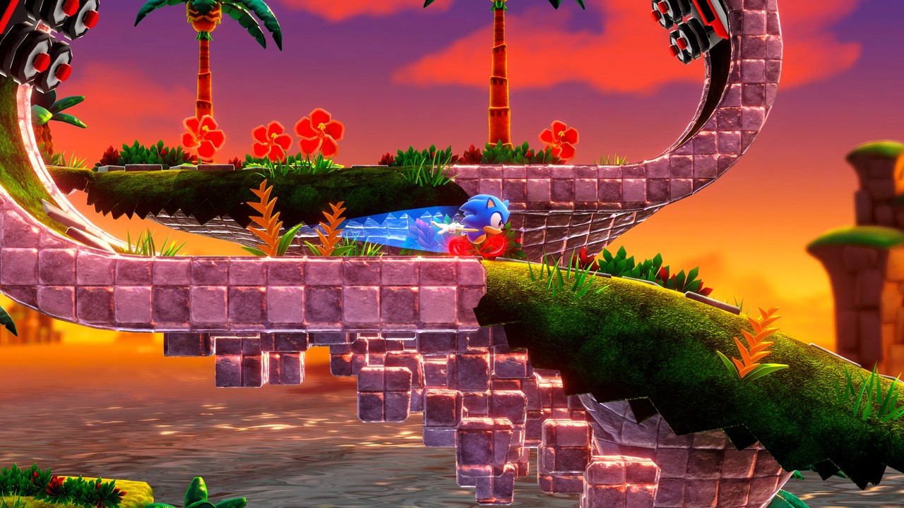
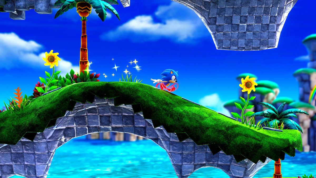
Superstars:

One is an ugly piece of shit and the other is Superstars. Even if you don’t like how Superstars looks, it’s on a completely different planet from Sonic 4.
Nah. They’re really not close at all in look. Superstars looks more similar to the Classic Sonic stages in Generations more than anything else. And both are way better looking than 4. 4 is one of the ugliest creations I’ve ever seen and should’ve stayed as a mobile game with a separate name.I perfectly remember Sonic 4 and the 2D assets were high res ans looked good, despite the lack of variety.
The screenshots speak for themselves. One certainly isn't ugly as shit while the other good. They are pretty close in terms of look.
Well, that's your opinion. I'd prefer 2D assets over 3D any day for something like Sonic.Nah. They’re really not close at all in look. Superstars looks more similar to the Classic Sonic stages in Generations more than anything else. And both are way better looking than 4. 4 is one of the ugliest creations I’ve ever seen and should’ve stayed as a mobile game with a separate name.


Physix discussion locked.
Superstars has a goddam good one.
:Boom headshot:
Biggest thing for me is NO OLD levels! I'm tired of reused levels for nostalgia.I think it looks fantastic honestly. The style looks spot on. Level design i am not entirely sold on yet, though I absolutely loved Sonic CD because it enforced more exploration and finding spots to launch time travel. I can see the Sonic CD influence in this game, but the first level looks like a proper classic Sonic level. Its apparent there are some modern mechanics in there, like ring dashes, i'm not the biggest fan of those.
