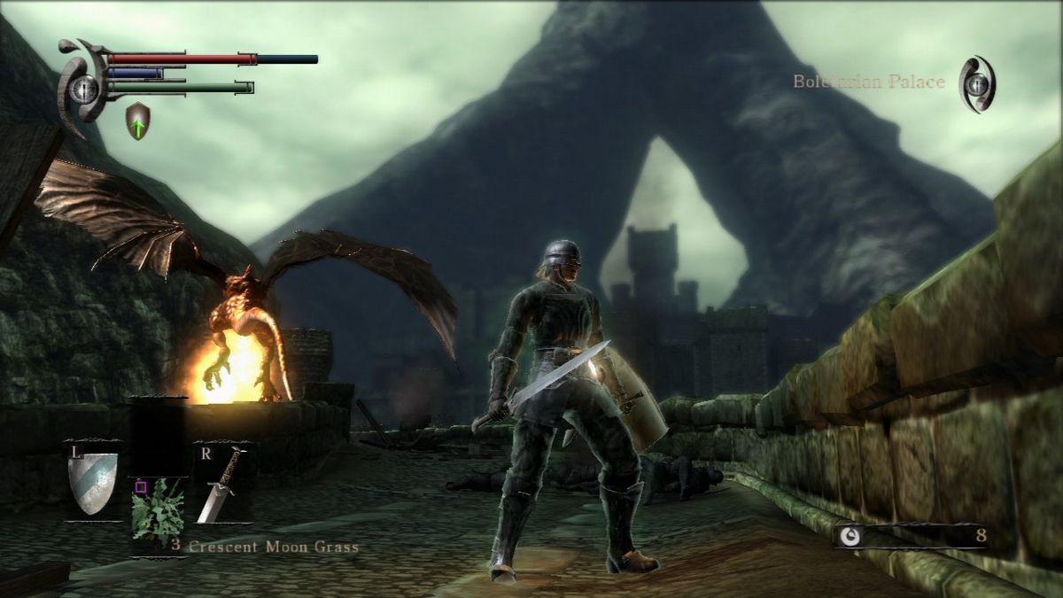
Difficult to know where to start with the remake. Of course it is technically better, being on a console two generations ahead, and is more performant in the 60fps mode. But it's just artistically devoid and a simulacrum of the original work.
Bluepoint are hopeless when it comes to character designs. The video touches on a good number of examples, like the Fat Official. This isn't Bluepoint's first botched rodeo, as they produced a similarly egregious design for Wander in Shadow of the Colossus. It's puzzling how a developer which has the pedigree of le elite remastering company can put out such shockingly sub-par work on anything meant to resemble a human being. It's easy to retort "but what about the awful looking originals???", when character modelling improvements
should've been the easiest slam dunk over the original.
In terms of world design I am not a fan of just about anything Bluepoint did. People shit on the color filters of the original but it created an atmosphere of pestilence which the remake misses. DSR has a bluer, colder feeling atmosphere which does not elicit nearly the same feeling of hopelessness. What's visually interesting about the original Demon's Souls is how much it leans into dim lighting and overcast skies. There are very few games which look like it and these images are purposefully small to draw attention to the color grading:
I think my favorite example of it is Shrine of Storms. It looks amazingly grey and bleak in the original, almost like visiting distant isles of Britain:
The remake on the other hand decides that it's not enough to let the overcast sky and the wind speak for itself - it also needs to have rain. And shiny ground textures to go along with that rain. And of course it needs lightning too (because it's a Shrine of
Storms, after all). Lightning which sets a tree on fire, giving the artist an opportunity to insert orange into a blue tinted level to show that they paid attention to complementary color theory in art school:
The irony is that by placing more emphasis on the rain than the wind, the attempt to make the weather in this level feel more erratic actually backfires. The remake just feels like a moderately rainy day, audibly resembling one of those ASMR rain videos you find on Youtube which people use to help get them to sleep. The original's gusts of wind, reflected in the sound design too, actually create a greater impression of abnormal weather to me.
I guess my ultimate issue with the remake is one of excessive design. All restraint seems to go out the window and it almost feels like a Hollywood-isation of the original. Bluepoint's approach to the level composition feels more like they're dressing a movie set rather than designing something that feels natural and lived in, almost like someone was working through a checklist called "atmosphere" to make sure they have all the cliched elements.
If a level is set in a storm, it has to be
rainy and have
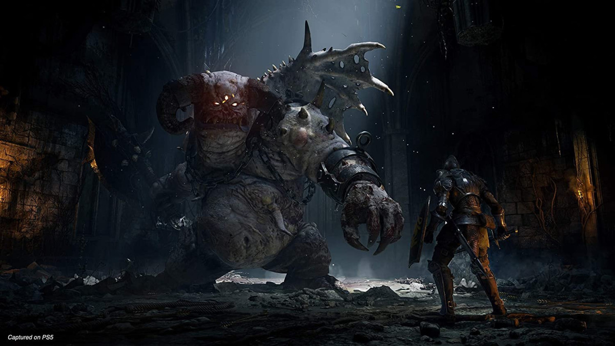
lightning off in the distance like an old Dracula horror movie. A character is a monster, so it needs to have
oozing boils and pustules on it so the audience really gets that it's a
monster. Flamelurker is on fire, so his arena also needs to be literal
fire and
brimstone, because
hell, and needs to look like an Unreal Engine 4 tech demo to show off all the pretty lava particle effects. Architecture has to be overdesigned just to show off how many polygons you can push on PS5 hardware and so the artist can post it on their ArtStation portfolio later.
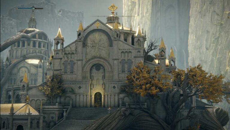
I'm of the opinion that these games are much better when they are more low-fi than high budget, so the early-gen PS3 look of the original does not faze me in the slightest. One of the most exciting upcoming games with a similar vibe is Labyrinth of the Demon King, which is not surprising considering it is influenced by the Souls predecessor series King's Field:


 Holy shit