IbizaPocholo
NeoGAFs Kent Brockman
Horizon Zero Dawn Remastered vs Original PS5 Early Graphics Comparison | State of Play
Original was captured on PS5.
Horizon Zero Dawn Remastered vs Original PS5 Early Graphics Comparison | State of Play
Original was captured on PS5.

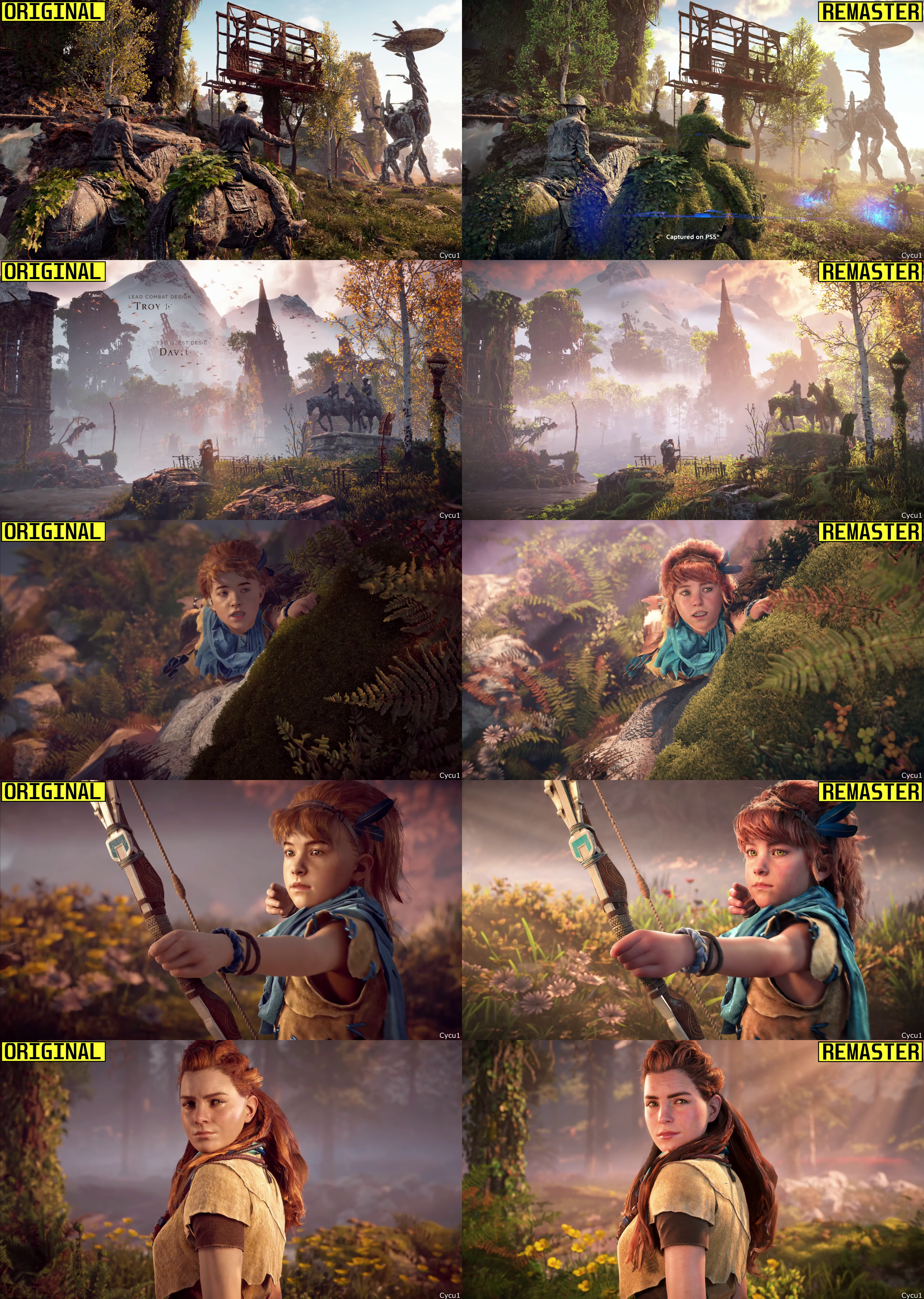
The right one is from a web video, right? Can't be this bad.Most of the trailer looks like difference in color grading and some higher draw distance in some far shots.
Rost looks less detailed in the remaster for some reason. They removed the blemishes from his face and changed his hair color.

The right one is from a web video, right? Can't be this bad.
yo thats worse.Most of the trailer looks like difference in color grading and some higher draw distance in some far shots.
Rost looks less detailed in the remaster for some reason. They removed the blemishes from his face and changed his hair color.


Most of the trailer looks like difference in color grading and some higher draw distance in some far shots.
Rost looks less detailed in the remaster for some reason. They removed the blemishes from his face and changed his hair color.

Watch the video.yo thats worse.
This is 100% fake because there's no way they actually made her face fatter for the remaster. No. I get the memes for Horizon 2. I get that they actually did make her fatter in Horizon 2. But there's no way they did it in the first one as well, right?! No.


Most of the trailer looks like difference in color grading and some higher draw distance in some far shots.
Rost looks less detailed in the remaster for some reason. They removed the blemishes from his face and changed his hair color.

Most of the trailer looks like difference in color grading and some higher draw distance in some far shots.
Rost looks less detailed in the remaster for some reason. They removed the blemishes from his face and changed his hair color.


Reminds me of the Arkham City 'remaster'Most of the trailer looks like difference in color grading and some higher draw distance in some far shots.
Rost looks less detailed in the remaster for some reason. They removed the blemishes from his face and changed his hair color.


Year and a half agoI still don't understand why they're pushing for this IP so hard when there's so many others people have been clamoring for.
Were you expecting different from a GAF Horizon Thread?You guys are nuts.


More time than your parents put into raising you with manners it seems.I'd love to know how long it takes to put together these fucking pointless remasters, and what else the dev team could have been working on instead in that time.
Oh of course, it's why it's happening. I just don't get it.Year and a half ago

Horizon Franchise Tops 32M Sales, 8.4M From Forbidden West
During the celebration of Guerrilla's 20th anniversary, it was revealed that the Horizon franchise has sold through more than 32 million copiesinsider-gaming.com
More time than your parents put into raising you with manners it seems.
Nixxies literal only job is ports and remasters.
Get the stick out of your assMore time than your parents put into raising you with manners it seems.
Nixxies literal only job is ports and remasters.
Most of the trailer looks like difference in color grading and some higher draw distance in some far shots.
Rost looks less detailed in the remaster for some reason. They removed the blemishes from his face and changed his hair color.

I know this is an enthusiast forum

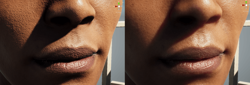
Rost looks less detailed in the remaster for some reason. They removed the blemishes from his face
The character details are worse all around.
Did the talented team leave or something ? How the hell a remaster has worse character details ?
With the exception of few things and better rendering on Aloys face model.... everything looks worse WTF
Aside from extra green grass here and there, it looks worse. The character details are worse all around.
Did the talented team leave or something ? How the hell a remaster has worse character details ? Oh and they had to make her fatter eh ?

An enthusiast forum that apparently doesn't know what subsurface scattering does..

Yup thats gaf for you. now watch this post get ignored lol.Were you expecting different from a GAF Horizon Thread?
Not sure how some of those comments will age once gameplay gets compared.. 90% of this is Pre-Rendered vs Real-Time.


New :

Old :

These guys will crawl back to their caves after DF analysis. I am suprised to see these comments on this forum. I thought these comments only reserve for Twitter. Apprently not.It looks better; better geometry, better foliage, better draw distance, better lighting!
But people must complain, they are than cool or whatever...


It’s literally copy paste. There are rebuilfing the game on the new version of the same decima engine and replacing the assets.I'd love to know how long it takes to put together these fucking pointless remasters, and what else the dev team could have been working on instead in that time.
Got your panties in a bunch over a bit of fucking swearing?
But point taken on Nixxes.
Feels like this should be a free upgrade to the existing game instead of charging for it though.
Reminds me of this lolMost of the trailer looks like difference in color grading and some higher draw distance in some far shots.
Rost looks less detailed in the remaster for some reason. They removed the blemishes from his face and changed his hair color.


You guys are nuts. they are literally reusing hfw assets and lighting which were a huge step up from the original. some character models will look different. Rost in that screenshot is literally only in there for the intro cutscene. he's much older after that.
every other character looks to have gotten a huge boost. This guy looks insane.

In gameplay, they have brought over the same exact foliage quality, hero lighting, character models and lighting.

