Just watched the conference/skimmed the thread(s).
Not as big of a jump as it was to iOS 5, but it's a pretty great upgrade all around. Even taking the new Maps out of the equation, the FB integration and NC quick-share buttons are going to be used by millions. I'm not digging the lazy iPad Siri integration though, tbh. They could've come up with something more sexy than an iPhone-sized semi-transparent Siri pane popping up in a drop-down style bubble. Yuck. Still welcomed of course.
I think i'll get used to the blue status bars, but it seems off-putting currently. Something about the contrast, it feels 'faded' to a weird degree. Almost like it's just a transparent blue menubar gradient overlaid on top of the black version. But we'll get used to it i'm sure.. Also, what's up with that white phone keypad? Optional? Probably already answered, but that'll be a bitch to use at night/in the dark. Ughhh.
Lastly, not digging the overall splintering UI elements. Might just be a stepping stone type thing, but it seems like there's just too much. Gradient charcoal nav-bars, glossy black nav-bars, silver gradient menu bars, light blue gradient menu bars, light blue gradient menu bars, etc. I don't know...
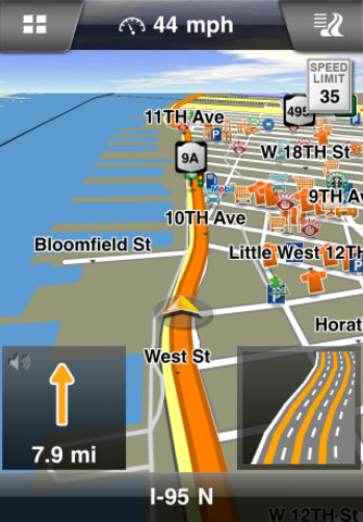
Oh and prob. already answered as well, but I assume turn by turn and flyover aren't compatible with one another?


